Branding Guideline Nobuhira

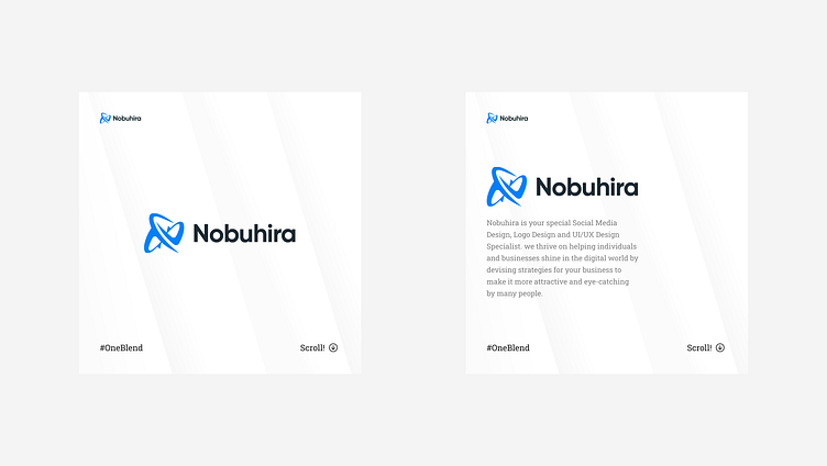
Primary Logo Design:
Nobuhira Studio's main logo is a sleek emblem combining the agency's initials, an "N" and a spiral "S", in a minimalist and sophisticated style. Clean lines and balanced proportions create a sense of order, while letter spacing conveys precision and attention to detail.
Logo with Company History:
Drawing inspiration from the agency's rich history, the logo incorporates a subtle visual element representing design evolution. The initials "N" and "S" are interconnected, symbolizing the journey of Nobuhira Studio's growth from its inception to its current modern identity.
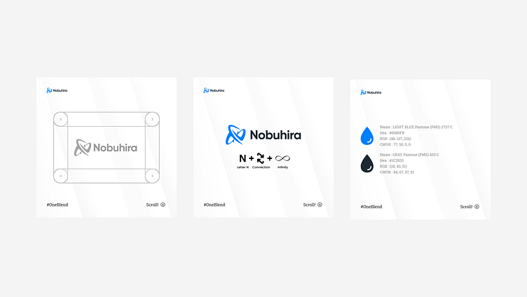
Logo Concept:
Logo Concept: The logo concept encapsulates the essence of innovative design. It merges the agency's initials seamlessly, depicting the agency's ability to blend creativity with structure. The design is a visual metaphor for turning ideas into visually captivating realities, portraying the agency's core strength
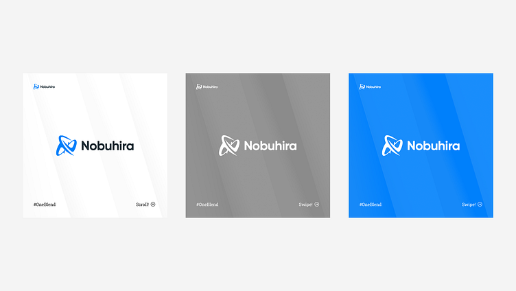
Logo with Other Color:
For alternative contexts, a monochromatic version of the logo in solid black can be used. This version retains the logo's simplicity and ensures its versatility across various applications.
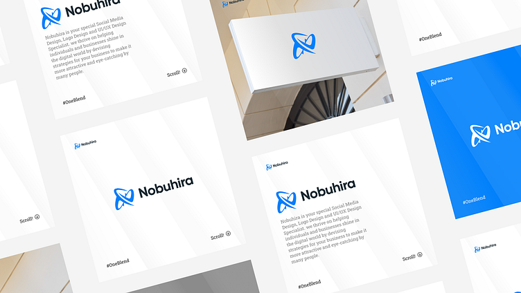
Mockup Signboard:
Imagine the Nobuhira Studio logo elegantly adorning a sleek office signboard. Against a clean white backdrop, the logo stands out in charcoal gray and mint green, capturing the agency's modern and creative spirit. The signboard mockup showcases how the logo seamlessly integrates with physical spaces, creating an inviting and professional ambiance for clients and visitors.
Incorporating these elements, the Nobuhira Studio logo portrays a clear, clean, and timeless appearance, embodying the agency's dedication to innovative design solutions.

Thanks For Scrolling! ✨
I hope you guys enjoy it. Press "L" if you like it.
follow our Instagram @nobuhira_studio
📧 Have a project idea? We are available for new projects