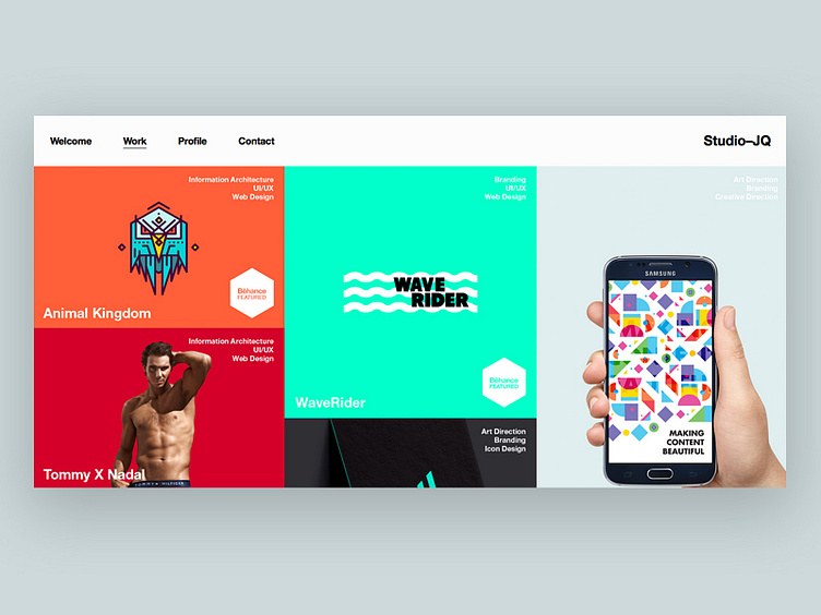
Work // Layout
Here is a sneak peek of the work section on the Studio—JQ website. Initially thought of dong a duo tone approach, but I get alot of good feedback on colour and how well I use it, so I thought it makes sense to use colour in the portfolio/client section. It's a challenge to make the various of styles of work sit together, but am getting there I think.
Comments/feedback always welcome.
Follow STUDIOJQ.. Behance | Twitter | Pinterest | Facebook All Works Copyright © 2015 STUDIOJQ.
More by MadeByStudioJQ View profile
Like

