Making Two Design System Pilots in Two Weeks: Dribbble Capstone
Introduction
Part of Dribbble's Scaling Design Systems course is a two-week design challenge to create a design system for the homepages of a sci-fi space travel company.
The Goal
The goal of the project is to be an example of easily configurable design systems at scale for a company with multiple projects. The only information provided is a small description of the scenario's client background and the three sites they offer.
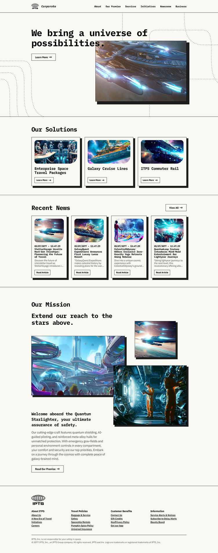
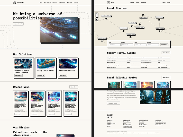
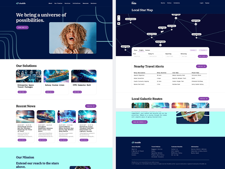
Corporate Homepage
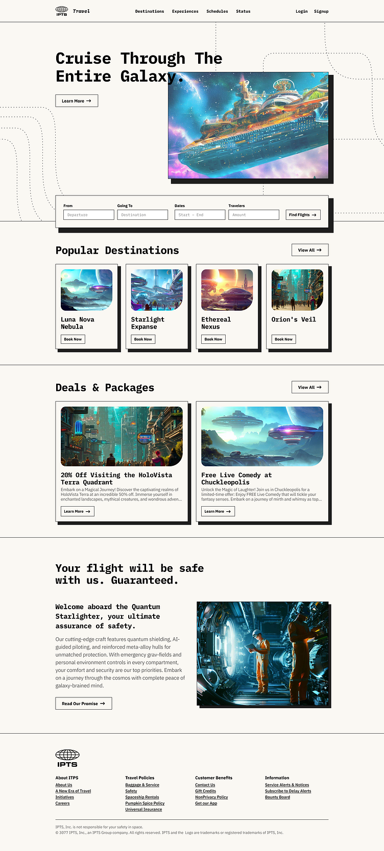
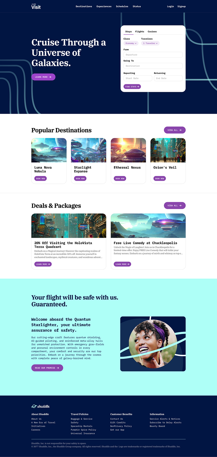
Travel Booking Portal (Like Expedia for space)
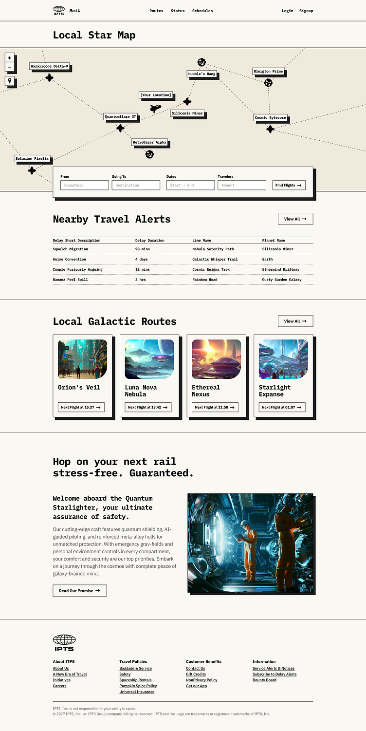
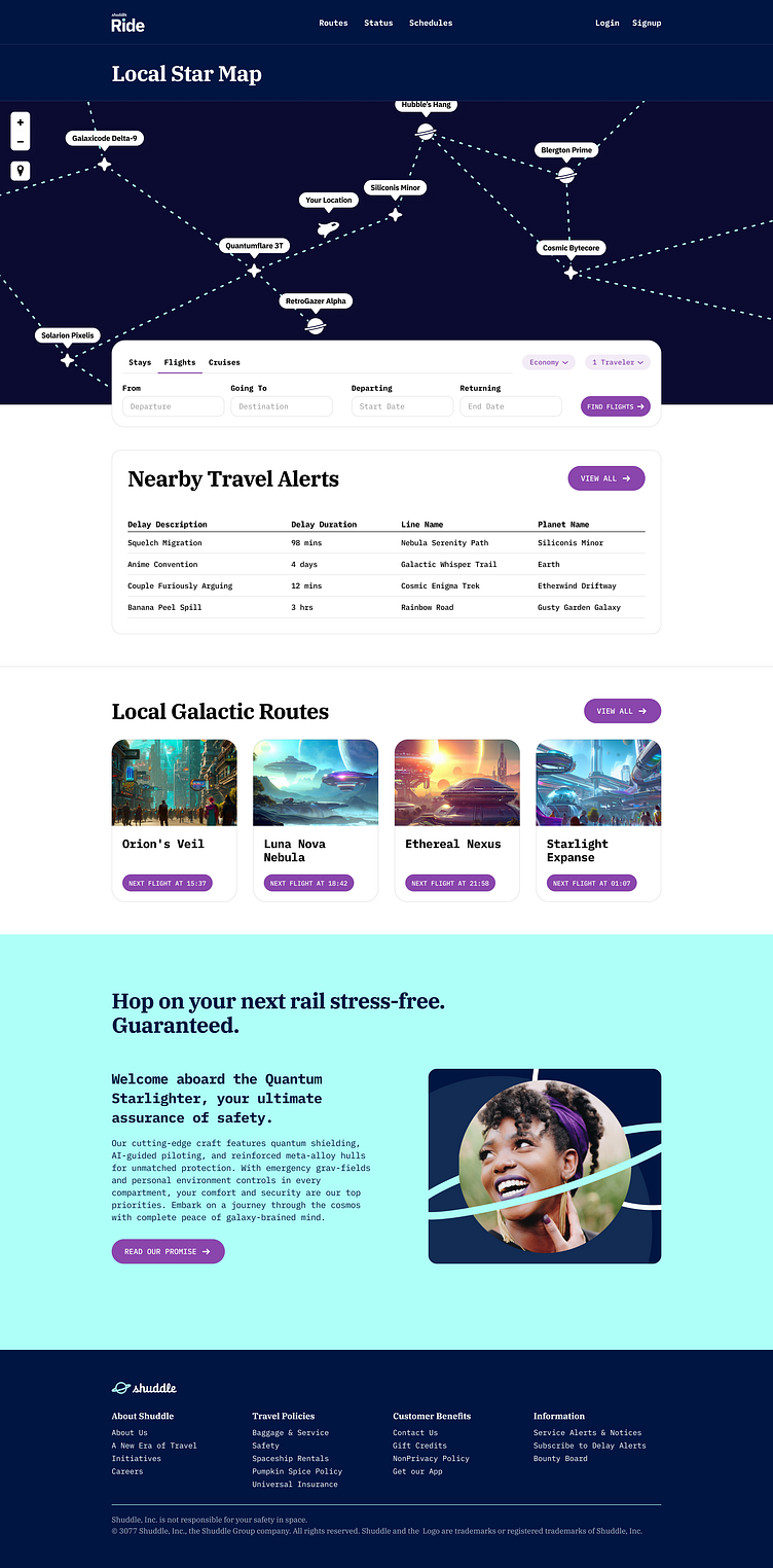
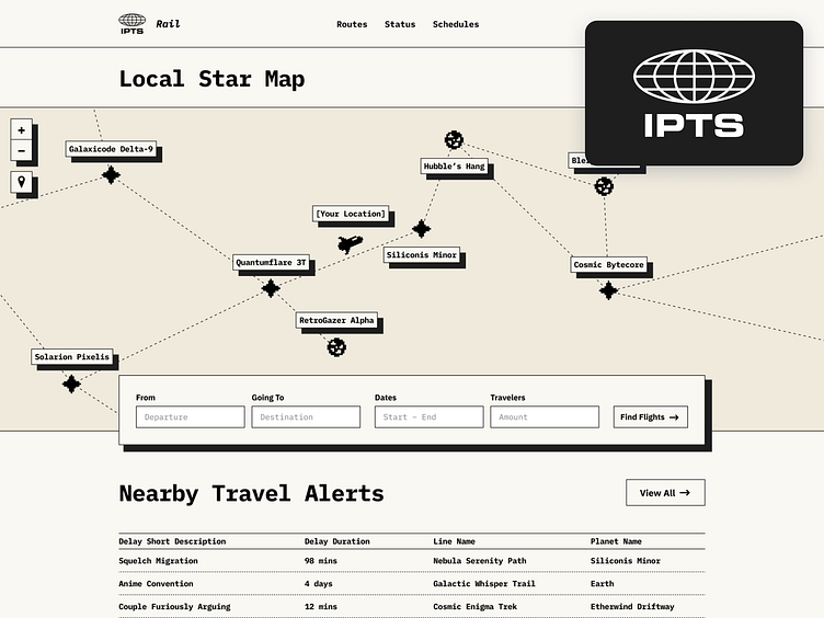
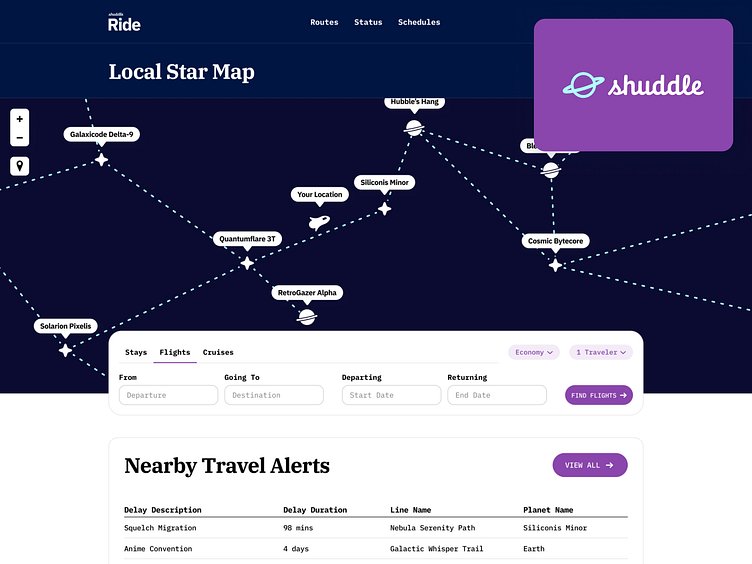
Live Status and Map (Like MTA.info)
Problem Statement
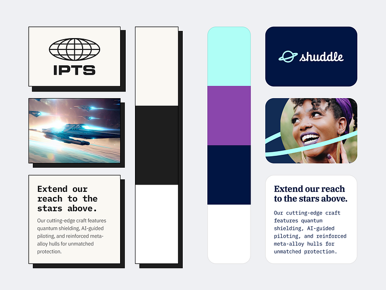
The result needed to become a website that could take advantage of design system benefits so that the project could later handle a complete rebranding after the first week and still hit the two-week deadline. That meant using a certain amount of components, design tokens, and system documentation.
My Role
The only parts of this project that were not my work were the logos for both companies and the branding for Shuddle. Everything else was up to me to do within the first week. This included:
Additional branding and discovery for ITPS
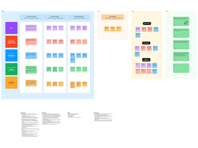
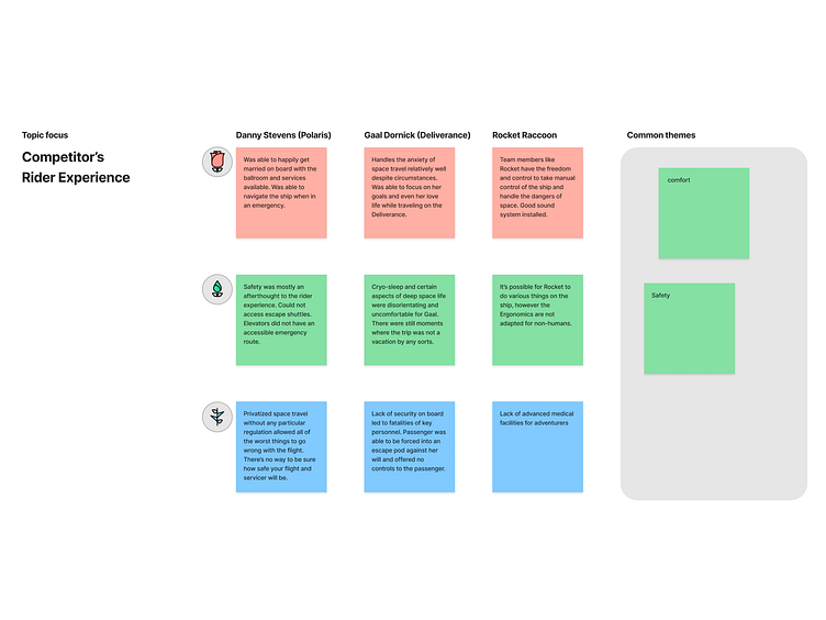
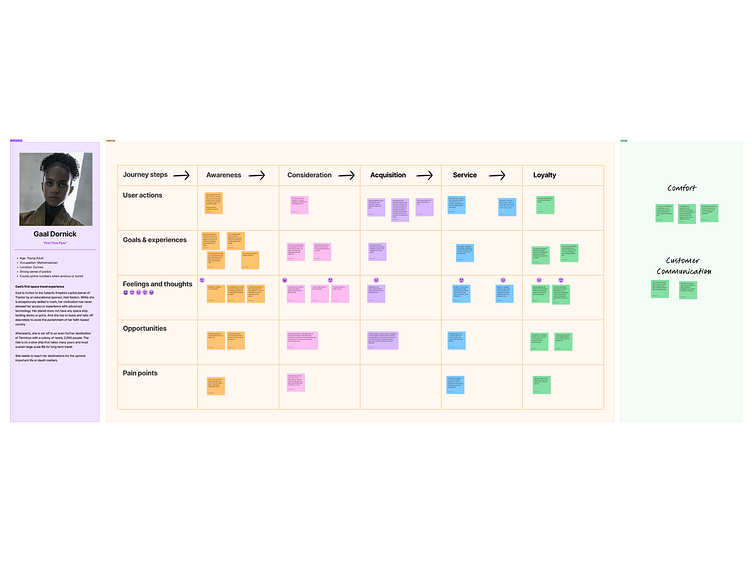
All Product Research
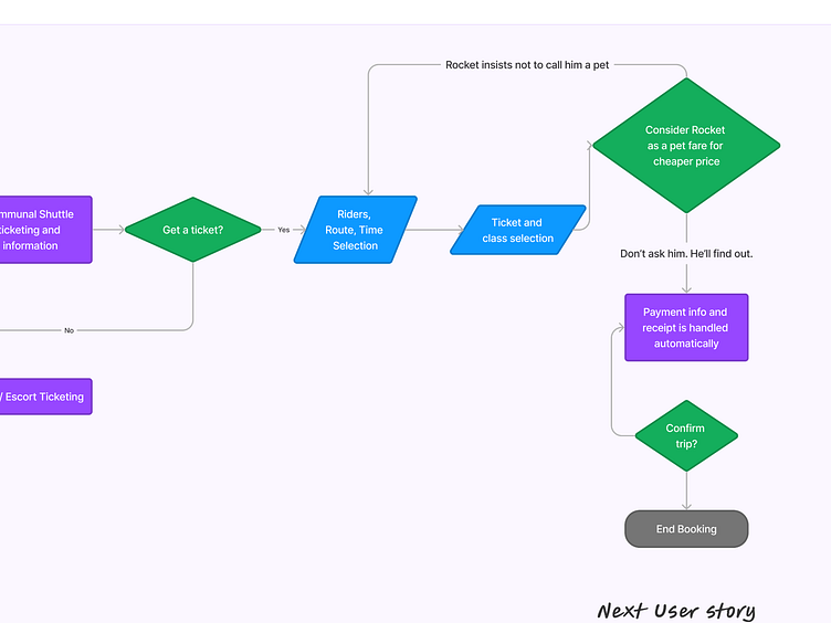
All Wireframing, UX, and IA
Copy, content, and asset creation.
Comp design
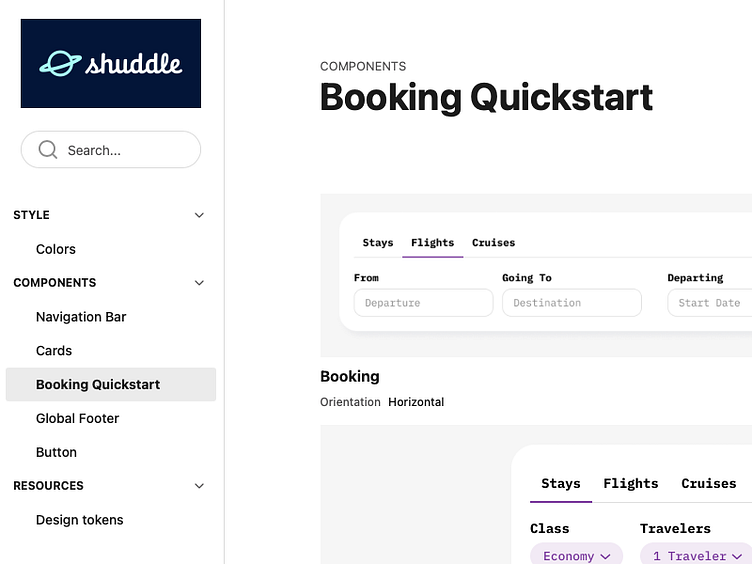
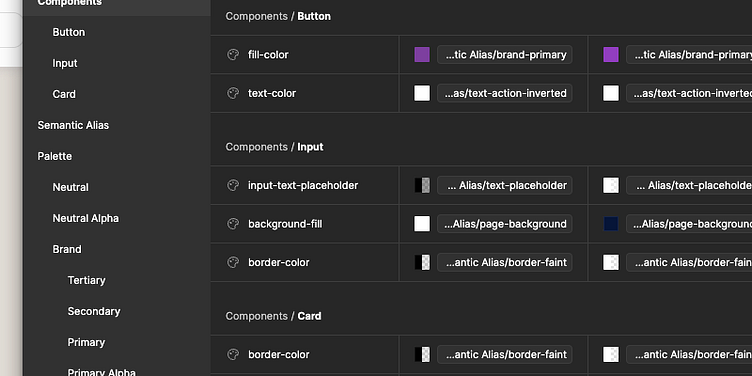
Design System creation and documentation
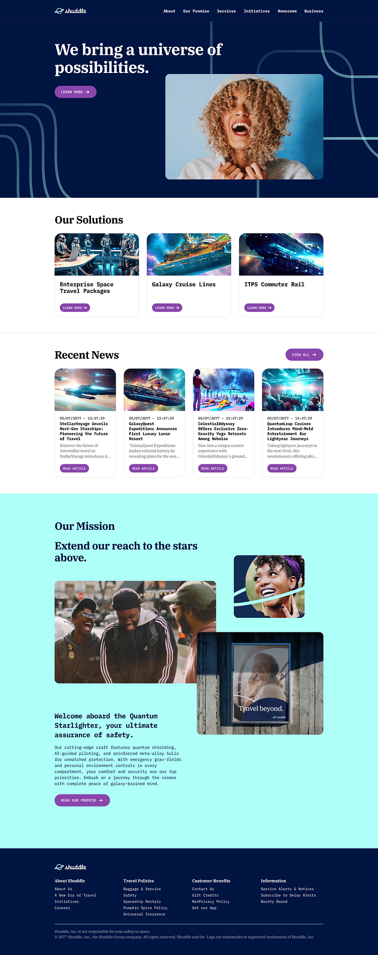
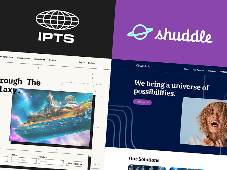
Handling a sudden system-wide rebrand
🚀 Fantasy Research & Discovery ✨
Since the project's point was only to create a working design system, realistic research, discovery, user stories, and information architecture were not only inessential but impossible to do justice to.
With nothing but the prompt to work with, I went through some basic product ideation and conceptualization steps. If I'm going to make a fantasy product, I might as well try to make it make sense for the fantasy world it exists in. While mostly fantasy, the research surfaced a few points I wanted to incorporate.
Based on space travel depictions in pop culture media and real life, space travel makes it difficult to compare present-day transportation services. A galaxy-wide network cannot be simplified like the NYC MTA. Most trips would not be short, like a 10-40 minute commuter line on a subway. What if you're traveling a distance in space that requires cryosleep or a warp drive? What currency is this audience using in space? Additionally, most customers would likely be way more concerned about safety in deep space than if they were booking a summertime cruise with Expedia.
They did product research on a grape.
I think this is where most product designers and design hiring managers will raise their eyebrows. Don't worry, I see you, and I felt the same.
I knowingly allowed myself to go down the rabbit hole trying to ideate more product ideas than this project needed. I wanted to see if anything pivotal would arise from the process.
Doing all that was at least valuable to me when onboarding myself into the project. I could have just copied Expedia's or United's layout and content or something to get by this part. Still, I would rather make a fake silly product that attempts to help those fake silly people than make a fake silly product that looks pretty and helps nobody. Well, really, both help nobody, but those imaginary aliens are thanking me; I can hear them!
So, with the timeline of most of this being a couple of days, I drew the line at a few basic insights for the tone and content: Ensuring traveler safety, the value of witnessing the unbelievable, and an aspect of embracing the weirdness of the fantasy society this kind of product would live. I mean, those are some decent product principles for this, right?
Perfect Storm, Meet Perfect Umbrella.
So, full disclosure. I figured out the project would have some twist at the halfway point. I didn't know what exactly the twist was or to what extent things would be flipped upside down. But I knew the point of creating a system is to handle system-wide changes more quickly than not. Based on deducing the value of design systems and what could possibly be a twist, I knew the twist was likely a rebrand.
However, what I didn't know is that I would also get sick with Covid-19 at the start of the second week. Hooray! I hated it!
After recovering from days in bed, I now had to rebrand the whole project after losing five out of the initially planned seven days. Without a design system, this simply would have been impossible. But because this project was part of a design system, I could meet the assignment's demands in a fraction of the time it took to make the first theme.
Making It With Time to Spare.
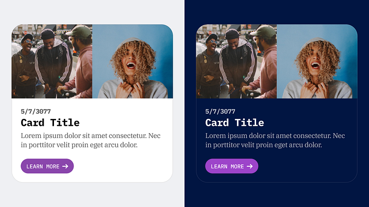
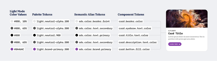
The result is just a pilot of the system using a few pages and components; however, making the system empowered rapid creation and broad, quick control. This kind of theme change usually takes an unprepared organization months to years to adapt. But, with just a little system planning, I could move fast without breaking things while providing clear communication and documentation at the same time. Most of the tokens even already support an early dark mode, even though I don't really show it.
Of course, there are many other things I would have added or done if I had more time, but two weeks is two weeks, and it was fun to do this exercise! Thank you for viewing, and let me know what you think!