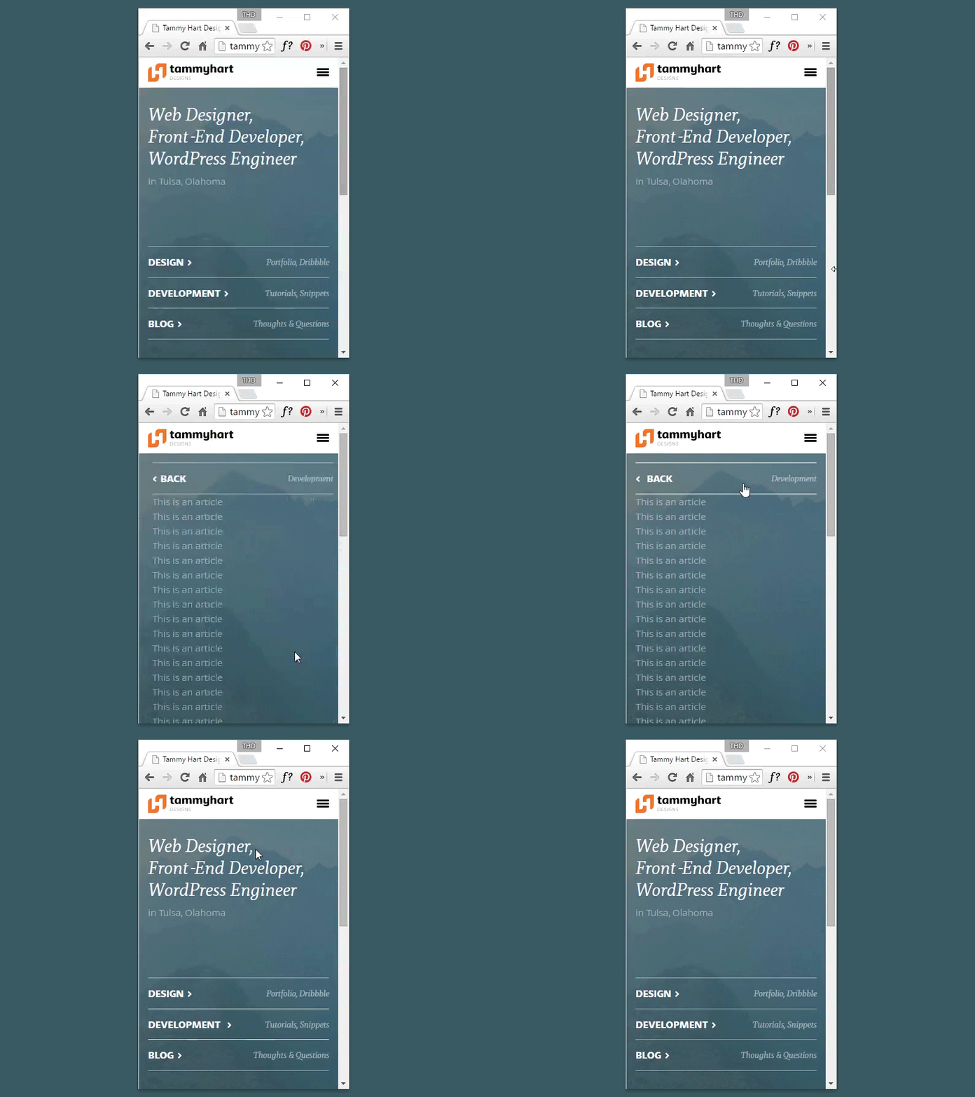
Slide Homepage Panels v2
The way my markup works, the three tabs were sliding in from the bottom because the main panel grows in height. This looked okay, but it wasn't natural since the most obvious transition is a horizontal slide. So I adjusted a couple things to make them stay where they are, rather than sliding down with the expanded panel. Then I adjusted the transition speeds so that they float in one at a time.
More by Tammy Hart View profile
Like

