Spotlas | Redesign
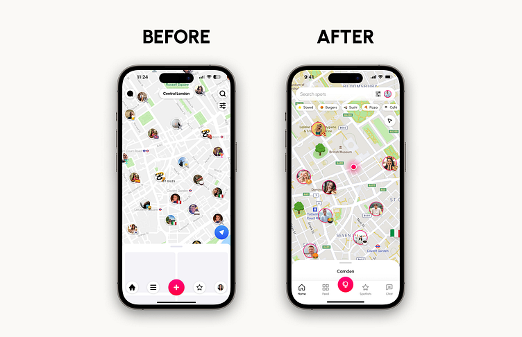
I was asked to redesign Spotlas' home screen. Here's my version.
Putting the search bar and filters button together makes it easy for users. This is common in popular apps and feels natural. Users will find it familiar.
The Filter button takes users to a different screen for all filters. This keeps the map clear on the Home screen and gives a better experience. As Spotlas grows, more filters can be added, and they'll be easy to find in the search bar.
The Profile option has been relocated to the search bar, following a design approach commonly used by Google. This familiar design pattern is user-friendly and aligns with users' expectations.
I added a special area in the Header with quick filters next to the search bar. This lets users quickly use common filters without going to another screen. This is really useful when users know what they want and need to filter things fast without extra steps.
Adding a way to get back to your location on the map is important. I put it in the top right corner to prevent accidental taps, which can happen when it's at the bottom right. This keeps it easy to use without any confusion.
The chosen size for the avatars on the map appears to be ideal for this design. It provides good visibility for the avatar pictures and allows the Spotmojis to be easily distinguishable. Overall, it seems to be an appropriate and well-suited size for this purpose.
I used the brand's colors for the Person icon so it's easy to spot. I also added a faint fog effect around it. This makes the icon stand out, especially when the map is busy with lots of icons.
Redesigning the Home screen posed a challenge in showing the map's previewed area. Taking cues from Airbnb's successful app design, I found a solution. The problem was connecting the area name at the top with its content at the bottom. I solved this by putting the area name at the bottom, right above its info on the map. This design is inspired by Airbnb's easy and practical style. This change removes the old split between area name and content.
The main focus of the Home screen revamp was the tab bar. The icons were inconsistent and circular, like the avatars on the map, which could be confusing. To fix this, I implemented a set of matching icons and added a background to the tab bar, with a subtle shadow up top, separating it from the map.
Additionally, by integrating a call-to-action within the tab bar, one of the most important map actions remained easily accessible, grabbing attention with a primary color.
Overall, the updated tab bar achieved a modern, simple, and visually effective appearance.
By relocating the profile option to the search bar, I have created room in the tab bar for a frequently used option - the Chat feature.
By placing the Chat option prominently in the tab bar, Spotlas encourages users to utilize this feature more frequently compared to the previous design where it was somewhat overlooked in the top left corner, an unconventional placement for a Chat option.
This change helps build a stronger community feeling, which Spotlas aims for.
I added the Globus icon to the design, which is important to the brand. I used it for the button that opens the 'Choose a spot' screen, which seemed like a fitting spot.
This was really an enjoyable experience for me to find various solutions for the pain points that were presented for the previous Home screen design. Overall, I designed a new screen that is visually resembling the last one, but with a better visual understanding, less clutter & a few more intuitive options.
I'm available for new projects!


