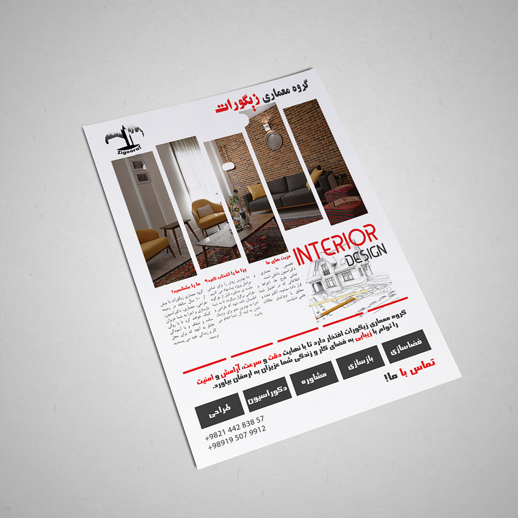
architecture flyer
hey guys
this is a flyer for Zigoorat architecture company. I made this years ago and they even use it today.
the manager loved the combination of red and black which is the main colors of the company.
They wanted to use different fonts, an edgy font for the motto and other big texts and a soft font for the main paragraph.
This concept is more of a Corporate style design and it's definitely not minimal.
Hope you like it, i'll be waiting for your ideas in comment.
I'm open to work and you can also contact me by email: i.da_farahani@yahoo.com
More by aidafarahani View profile
Like
