Rayna UI: Colour System
Hello Dribble Community!
In the realm of the Rayna UI universe where meaningful colour application takes center stage. Here, you'll choose primary and secondary colours to embody your brand.
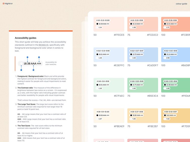
Our harmonious colour themes ensure legible text, distinct UI elements, and accessible design.
We made sure to craft a system that offers purposeful colour styles, serving as an excellent starting point for any project.
Notably, contrast is very key for text legibility, which is why we've thoughtfully integrated WCAG 2.0 contrast ratios into our system.
Prioritize accessibility while designing with us.
More by RaynaUI View profile
Like


