Kritters - Dog Walking App

Problem
The current dog walking industry lacks a streamlined and reliable system for connecting dog owners with professional and trustworthy dog walkers, leading to inconvenience, uncertainty, and potential safety concerns for both parties.
The primary objective of the Kritters app was to create a platform that seamlessly connected dog owners with skilled and trustworthy dog walkers, enhancing the overall dog walking experience
User Research
In order to create a successful and user-centered dog walking app, extensive user research was conducted to gain valuable insights into the needs, preferences, and pain points of both dog owners and dog walkers.
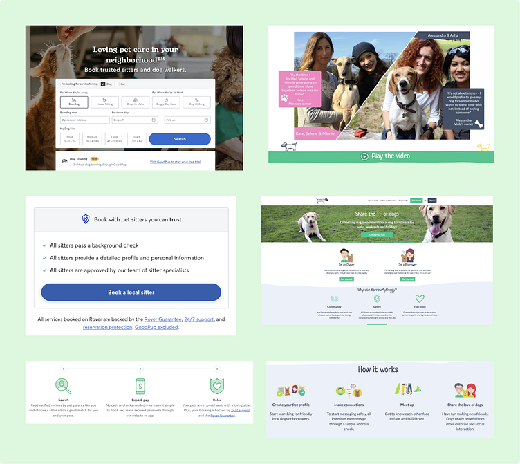
Marketing Research
Although I focused the research on two apps, Rover and Borrow My Doggy, both with a different main focus where Borrow My Doggy focuses more on connecting people through community and Rover focuses more on connecting people through services. In both cases the idea around showcasing trustworthiness seems to always be prevalent.
They both take different approaches where Rover symbolises this with trustworthy assuring statements and Borrow My Doggy take a more community approach encouraging their users to leave video testimonials.
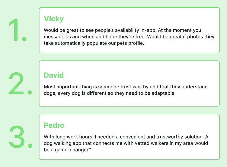
User Personas
Introducing Glen, a 32-year-old copywriter who leads an active lifestyle and shares a special bond with his energetic dog, Rua. As a busy professional, Glen often finds it challenging to juggle his work responsibilities with Rua's exercise needs. He recognises the importance of regular walks for Rua's physical and mental well-being but struggles to find a reliable and flexible dog walking solution that aligns with his schedule.
This user persona will delve into Glen's motivations, frustrations, and aspirations, providing valuable insights for the development of a dog walking app that caters to his specific requirements while enriching his experience as a dog owner.

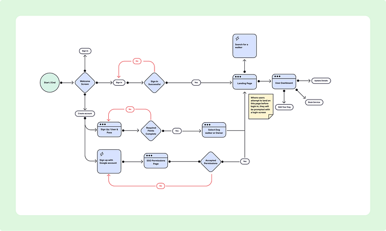
User Flow
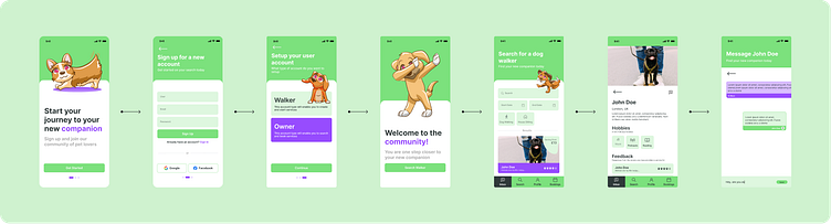
This onboarding flow focuses more on a speedy onboarding. My assumption here is:Reducing the barrier to getting started would make our app more favourable and will therefore be more likely to be recommended.
Only getting the essential details when signing up makes our onboarding process faster. All other details could be added once they are registered, meaning the barrier for entry to begin your search can be considerably reduced.
Wireframes
Here I wanted to focus on reducing the steps to getting started and simply have a simple onboarding process where we sign up with our account details and then select our account type. Once the user is registered we can prompt them to enter the rest of their required details.
This way they will be able to begin their search and explore the application and only when they need to book a service will we require them to complete their details before continuing. I’ve maintained a similar structure between the two designs but tried to make things more clearer and added a little more detail. I also added more trust indicators including the stars, the feedback list and a verified badge.

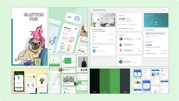
Design Exploration
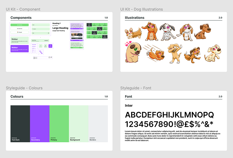
I’ve explored various designs here to get some initial ideas on the potential look and feel of the app. Here we see ideas for the colour palette, illustrations, fonts and structure.
From the mood board explorations i’ve constructed high fidelity wireframes and played with the colours, fonts and layout. here I tried to explore different ways I could incorporate the colour palette into the design.

From both the mood board and the wireframes I concluded that the design had to have a more fun and colourful approach. I updated the colour palette to include dome more bold colours to give emphasis to certain areas of the application
Prototype & Testing
First prototype received some feedback about the placement of the message buttons and confusion around their functionality as wel as the imagery not display the users face. Following this feedback, I updated the design to amend these issues and provide more clarity.
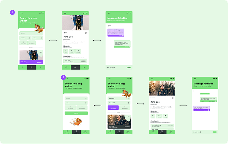
The final design works off the second test which indicated issues with functionality such as not being able to book without having to engage in a chat first, updating the name of a page from messages to inbox and some other additional details. The final prototype incorporates all this feedback.


Conclusion
Throughout this transformative UI/UX design course, I've grown both personally and professionally.
Learning to prioritise user needs, leveraging visual design principles, and embracing iterative processes have all deepened my understanding of creating impactful experiences.
Collaborating with peers and receiving valuable feedback has been instrumental in refining my skills. As I step into the design world, I am confident and excited to contribute my expertise and create designs that leave a lasting impression on users. Thank you to the instructors and fellow students for making this journey unforgettable; I am now equipped with the tools and mindset to tackle any design challenge that comes my way.