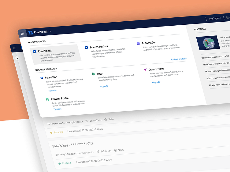
Header navigation
🔧 Solving the Puzzle
The challenge at hand was to streamline the view and access of a wide array of offerings while ensuring effortless user engagement. Through meticulous design thinking and research, I aimed to simplify the user journey and facilitate seamless exploration. One of the cornerstones was the introduction of a highlighted informational resources section. Users can now readily access support, tutorials, and helpful resources without disruption. This addition aimed to empower users, making their interaction with the platform not just transactional, but educational.
💼 Cards that Connect
The design wouldn't be complete without addressing upselling and cross-product integration. Embracing a card-based design approach, I integrated upselling content for products that complement users' existing acquisitions. This strategic touch doesn't just showcase products—it offers users an invitation to explore further, deepening their engagement and potentially expanding their product portfolio.
This project isn't just about aesthetics—it's about creating a dynamic ecosystem where users feel valued, informed, and empowered. It's about delivering a cohesive experience that seamlessly blends practicality and aesthetics, ensuring users journey through the platform with confidence.
Work with us!
UserActive is a product design agency for B2B SaaS. We’re on a mission to help SaaS Founders create meaningful products users love.
Book a call 👉🏼 www.useractive.io
