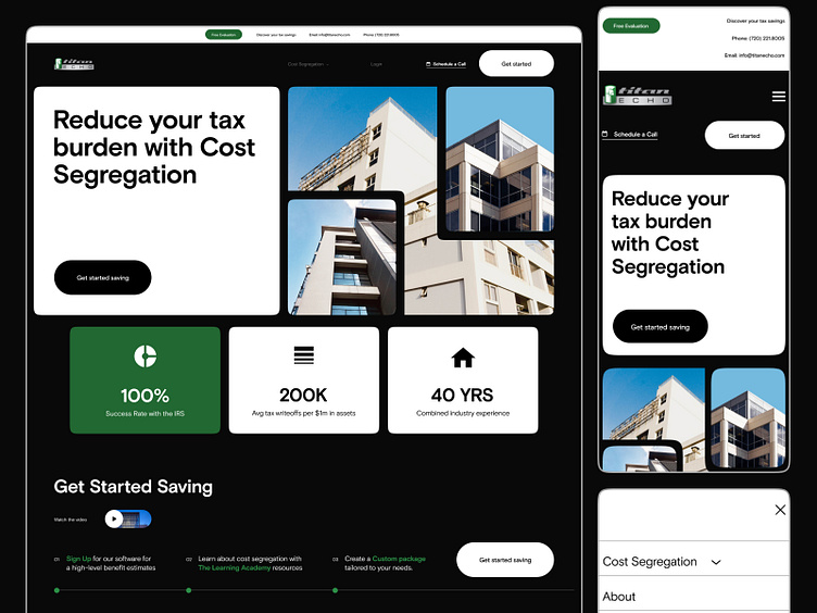
Titan Echo is a financial services company's website
Hi👋
The challenge was to make a simple website design for a company providing tax cost reduction services for non-movement investors. We designed a minimalistic, clean website using a contrasting black and white color scheme and added the company's signature green color. This palette helps to clearly emphasize important information and highlight important blocks. We made a block design, using cards. We also showed photos in an unusual way to give the design a more interesting look. Additionally, we worked on the mobile version and made it user-friendly
What do you think of the result?
I hope you like it! 😉.
Feel free to leave feedback and comments.
Don't forget to click ❤️ if you liked it.
Thank you!!!
I'm open to new projects in different niches. Just email me at:
📪 Email: nikitastavitskiy@outlook.com
