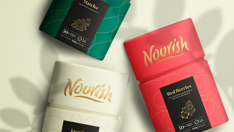
Nourish Premium Tea Packaging
Conceptualizing a premium tea brand
Nourish Premium Tea emerged as a personal challenge in my lettering and packaging design studies. The endeavor aimed at crafting a distinctive lifestyle brand that would capture attention on the shelf and in the online market and remain a cherished visual element for customers at home.
Design-wise, my focus centered on formulating a purposeful wordmark that would serve as the cornerstone of the brand's visual identity. Consequently, I delved into two distinct stylistic avenues: one marked by structure and the other embracing organic flow. These routes, though divergent, were united by a shared motif - the tea leaf - which was then integrated into the packaging design.
Vector Progression (above)
& Final Vector (below)
Does your packaging need some custom lettering that truly stands out?
Discover more about me and my creative process here.
More by Daniel de Sousa View profile
Like


