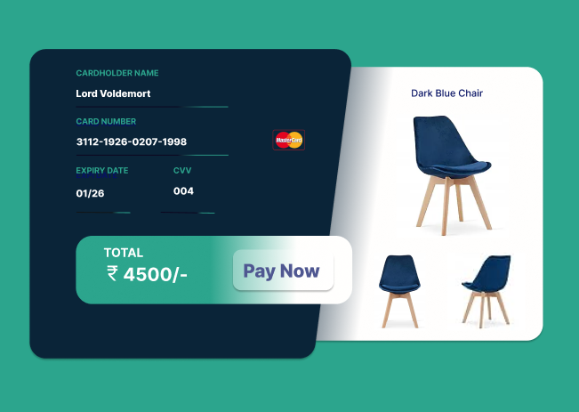
UI Design Challenge
UI Challenge, designing a Credit Card Checkout 💳
Do you experience anxiety while shopping online? 😟
Well, when I received the latest UI Challenge, it was all about designing a Credit Card Checkout 💳.
As I explored various credit card checkouts found on almost every website, a familiar feeling of nervousness emerged.
Why? There are a few reasons.
1.The layout of payment gateways can be overwhelming, resembling the tension of taking an exam.📰
2.The thought of money being deducted from your account can be a bit painful. 💸
3.Unlike in physical stores where you can see your items being packed, this visual assurance is often lacking online.🛍
In my interpretation of the latest UI challenge, I've aimed to address these aspects from a personal perspective. Your feedback is more than welcome as I strive to create a better online shopping experience!
