Keen Cans
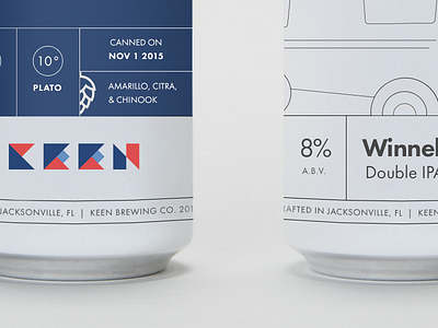
A quick and dirty mockup of some packaging and design for cans for a new brewery. The Winnebago illustration on the right is still a WIP, but you get the idea.
I really liked the idea of a clean, white can with solid lines and strong type. Sprinkled with the blue and red colors I think a 4 or 6 pack of these would look beautiful on shelves!
More by Carlos R Andujar View profile
Like

