LinkedIn Mobile App Redesign
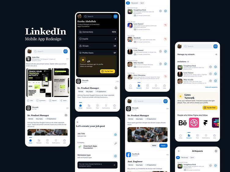
I've attempted to recreate the LinkedIn Mobile App UI as a practice to enhance my visual skills. However, I've made some changes to interactions and grids.
1️⃣ For the post section, I've reorganized the action bar and arranged the components vertically. 👈
2️⃣ Regarding the quick profile navigation, while the original app opens a sidebar, I've replaced it with a dropdown with a dark background to create visual separation. Also some new elements. Moved the Premium Subsription CTA inside the profile views section. ✨
3️⃣ I've merged all sent and received connection requests onto a single page for easier access. Users can still apply filters based on their preferences.
More by Eusha View profile
Like
