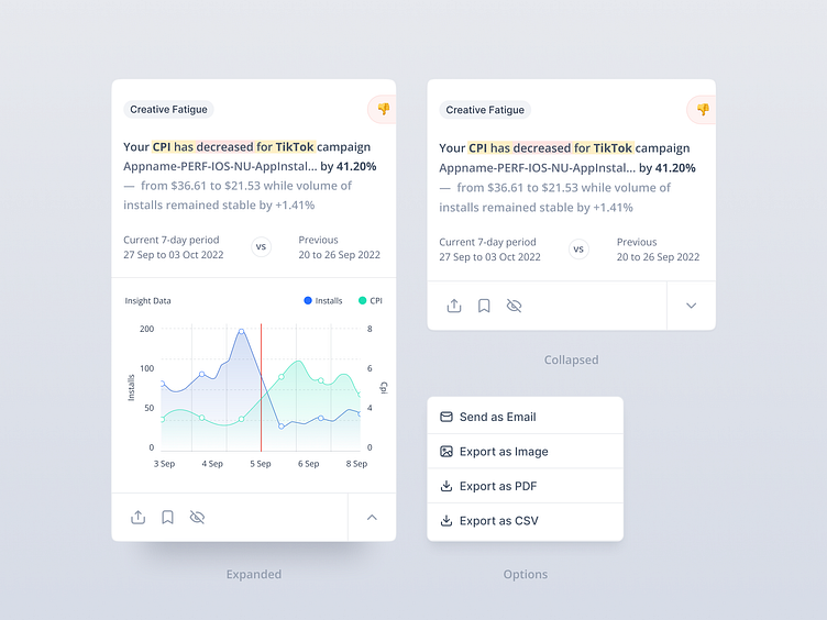
Card UI Design - Analytics Insight Reporting
Auto Insight Analytics Card Design
By introducing this feature, Appsumer not only addresses the issue of data abundance but also leverages its potential for generating valuable insights. The true potential of Auto Insights lies not only in its expanding use cases but also in its ability to prioritize insights. This prioritization ensures that only the most pertinent and actionable insights are presented to UA managers and marketers, maximizing their potential for optimization.
User Testing
During user testing, several pain points were identified. Made UX design iterations for the following:
Lack of Insights Hierarchy: Users found it challenging when insights were presented as multiple graphs without a clear hierarchy. They desired a starting summary followed by the option to expand into more detailed graphs, as this would make the information more digestible and easier to comprehend.
Graph Overload and Size: Participants expressed difficulty when presented with too many graphs at once or when the graphs were too small to interpret effectively. They sought a streamlined experience with fewer but more impactful graphs.
Desire for Key Takeaways: Testers expressed a desire for key takeaways or recommendations accompanying the insights. This would provide them with actionable guidance based on the data presented.
Card Design - Version 2 👇
UX Design Iteration 1: Insights Hierarchy and Expansion
To address the lack of insights hierarchy and the desire for a more digestible presentation, we have restructured the card design to incorporate a summary-first approach, followed by optional expansion for more detailed information.
The card now features a concise summary at the top, highlighting the main insight or recommendation. This summary is designed to capture the user's attention and provide an immediate understanding of the key point.
Users can click on an "Expand" button to reveal additional graphs and data related to the insight. This provides users with the flexibility to explore deeper details if they choose to do so, while maintaining a clean and organized initial view.
UX Design Iteration 2: Streamlined Graphs and Takeaways
To address the issue of graph overload and size, as well as the desire for key takeaways, I switch to a list card design, optimized the presentation of graphs and integrated actionable recommendations.
The card design has been improved with an expandable list format, allowing for a simpler and more organized display. Graphs are now housed within the expanded card, offering increased size for better visibility and comprehension of the data.
Alongside the graph, a concise "Key Takeaways" section is introduced. This section provides users with clear and actionable insights derived from the presented data. These takeaways directly relate to the graphs, guiding users on potential optimization strategies.


