Poster Design
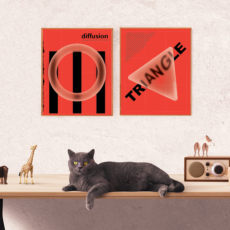
I made a typography poster with glass-like shapes that use the glassmorphism style. Designing this way was really enjoyable, and I learned a lot. The mix of typography and glassy elements gave the poster a cool and futuristic look that I'm proud of.
More by Muskan Bansal View profile
Like


