"Logix" Shiping and Logistic Branding
"Logix" Brand Experience Design | Brand identity
.
.
Available for your long-term or short-term partnership
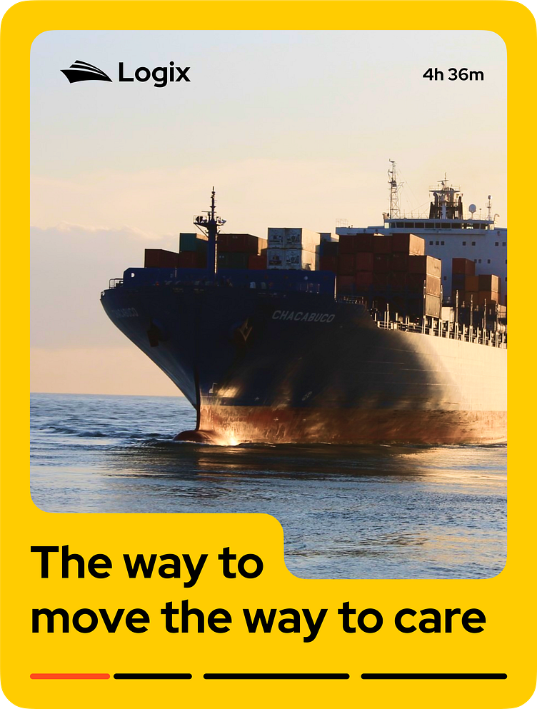
Project Overview: Logix is a comprehensive shipping and logistics management solution that required a distinctive branding design to communicate its efficiency and reliability. The goal was to encapsulate the essence of both shipping and a seamless logistic experience while incorporating the brand's color palette of orange, yellow, and black.
Design Concept: The concept behind Logix's branding design was to blend the imagery of ships and trucks, symbolizing the seamless transition between sea and land logistics. The use of the vibrant color palette aimed to convey energy, urgency, and reliability, while the ship-inspired logo added a touch of professionalism and trustworthiness.
Color Palette: The choice of colors played a pivotal role in conveying Logix's brand identity. The combination of orange and yellow exudes dynamism and optimism, perfectly aligning with the fast-paced world of logistics. Black was introduced to anchor the palette, adding a sense of sophistication and timelessness to the overall design.
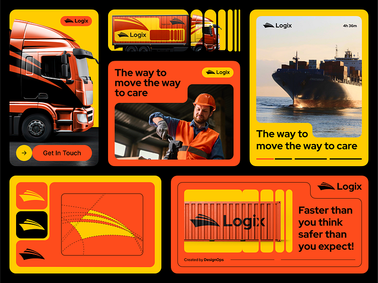
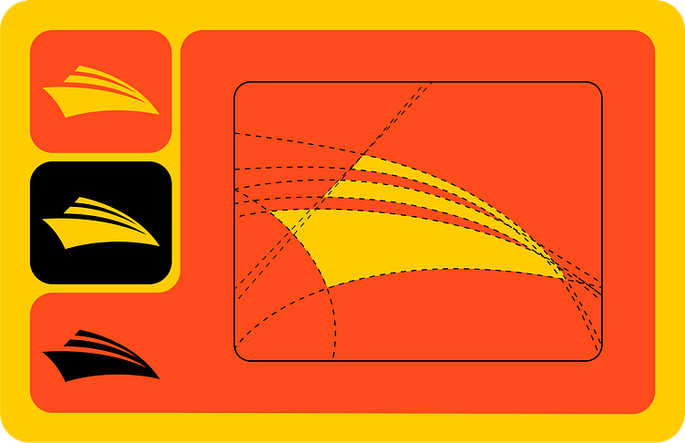
Logo Design: The Logix logo is a creative fusion of a ship's elegant silhouette carrying an assortment of goods, symbolizing the brand's seamless integration of maritime and land-based transportation. The logo employs bold lines and clean shapes that effortlessly draw attention and ensure immediate recognition.
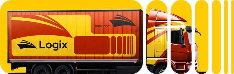
Truck Wrapping: The truck wrapping was a crucial touchpoint for Logix's brand visibility. The design seamlessly integrated the logo and branding elements onto the truck's exterior, ensuring that the brand would be noticed on the move. The ship-like graphics on the truck's sides reinforced the idea of a holistic logistics solution that spans land and sea.
Implementation and Impact: The Logix branding design was meticulously applied across various touchpoints, including digital platforms, marketing materials, and physical truck wrapping. The consistent use of design elements enhanced brand recognition and positioned Logix as a reliable and forward-thinking logistics partner.
Results: The Logix branding design significantly impacted the company's market presence. The bold color palette and memorable logo improved brand recall among clients and partners. The truck wrapping, with its striking ship-inspired graphics, transformed ordinary trucks into moving billboards, effectively capturing attention on the roads and generating curiosity about the company's services.
Find Case Study on Behance
Available for your long-term or short-term partnership
Love to help you with UX/UI & Brand-Identity Design and help you kickstart your business.
