Watchout App: a security agency
Presenting the all-new screens for Watchout, meticulously crafted to redefine user experience in the realm of dark mode design. As a dedicated UX/UI designer, I embarked on a journey to transform the app into an immersive, intuitive masterpiece.
🏠 Screen 1: Welcome Home
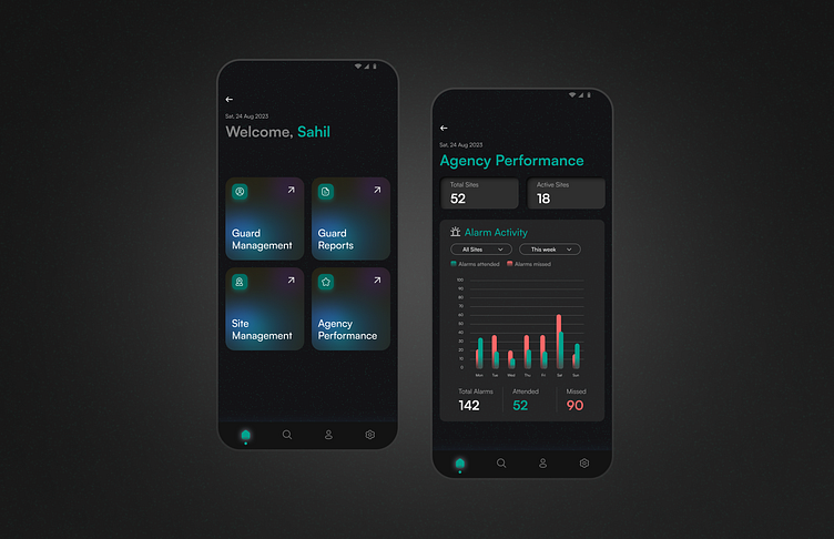
Step into a world of innovation with the 'Welcome Home' screen, where four square-shaped CTAs beckon users with a touch of glass morphism style. The fusion of modern aesthetics and user-centric design welcomes a seamless journey into the app's offerings. Explore with elegance. ✨ #UXDesign #GlassMorphism #WelcomeHome"
📊 Screen 2: Agency Performance
Unlocking insights at a glance, the 'Agency Performance' screen redefines data visualization. Every detail is meticulously curated to simplify the user experience while maximizing impact. By presenting key KPIs—total alarms, attended, and missed alarms—in a clear, concise manner, we empower users to save time and make informed decisions effortlessly. Streamlining complexity, one elegant visualization at a time. 📈🕒 #UXUIInnovation #DataSimplicity #AgencyPerformance"


