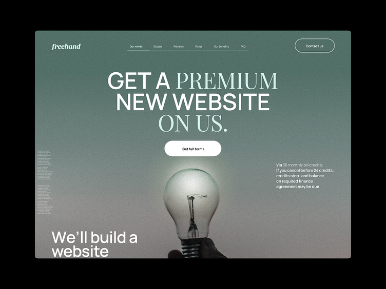
Freehand - Web Agency / Design Development
Hi👋
The task was to make a simple website design for a development services company. We designed a minimalistic website with a custom grid, great typography and graphics. We used dark colors, did a variant with light colors and selected graphics for the site in the form of background images.
What do you think of the result?
I hope you like it! 😉
Feel free to leave feedback and comments.
Don't forget to press ❤️ if you liked it.
Thank you!!!
I'm open to new projects in different niches. Just email me at:
📪 Email: nikitastavitskiy@outlook.com
More by Nikita Stavitskiy View profile
Like

