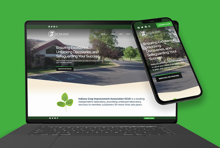
ICIA - Indiana Crop Improvement Association
Responsive Website Design
Problem
The Indiana Crop Improvement Association approached us with the need for improvements to their existing website. Clients and potential members had a difficult time navigating the site, and a good portion of the content was hard to find or cluttered making it difficult to comprehend. The ICIA brand was poorly represented, making their site seem disjointed and unfinished.
Solution
We recreated ICIA's marketing website in an exciting way to better represent the value they provide for the agriculture community. By reallocating space for the services and content, we made finding appropriate information easier than ever. By focusing the ICIA brand colors into a fresh new color palette for the web, the brand is in a better position to build recognition in their field.
