Veddan — Case Study — Brand Identity and Website Design
Veddan — Brand Identity and WebsiteFor a Premium Hi-fi Speaker
Type of design: Brand Identity, Website
Business area: Hi-Fi audio systems and home speakers manufacturer
Client
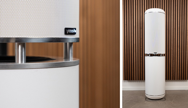
The Veddan speakers utilize the newest patented technology to produce audio of exceptional quality that's on par with a live orchestra. This allows owners to relax and escape into different worlds, all from the comfort of their own homes.
Design Goals
We aimed to establish a unique identity that effectively communicates our product's functional and emotional benefits. The sound reproduction is of extraordinary quality, capable of transporting you to another world. Music is an art form that deserves to be fully enjoyed without any compromise on quality, just as it was intended.
During the development of the brand identity, the audio equipment market was already mature, with established leaders and diverse product offerings. We researched major well-known and respected competitors such as B&O, Bose, and Harman/Kardon. It was our goal to create an identity that would make a lasting impression and stand strong against these competitors. Moreover, the identity of our speakers needed to align with their premium price positioning.
Concept
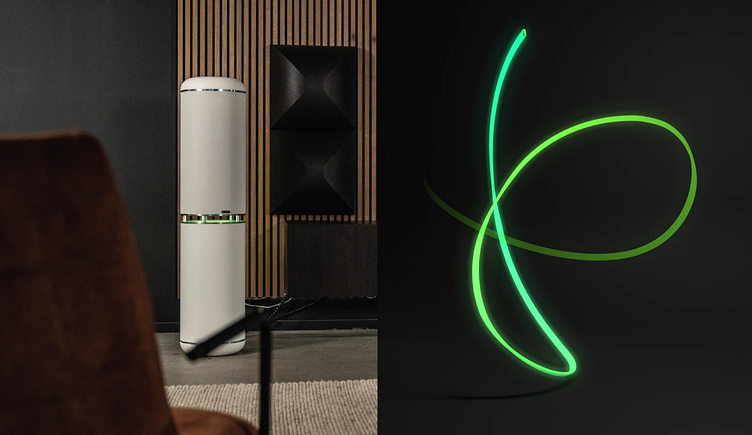
We’re like a collider
A collider is a cutting-edge device that allows us to explore the unknown world of elementary particles, which are impossible to study with the human eye alone. Similarly, to truly capture the essence of original music, a Veddan speaker is necessary. This type of speaker produces sounds similar to those of live musical instruments, and its elongated tube shape resembles that of a collider. This technology allows our clients to delve into new and exciting realms.
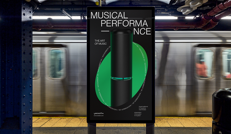
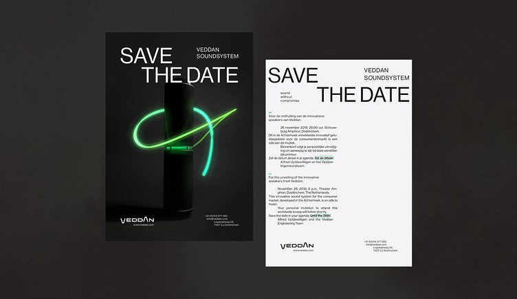
To fully convey the metaphor, we utilized every aspect of identity (logo, graphics, typography, photo style). We demonstrated the moment when reality shifts to another dimension. As the music begins, the surroundings transform, transporting you to an alternate reality
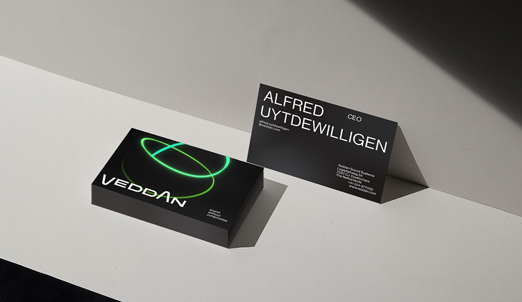
Logotype
The logo features two letters, V and A, which are similar and symmetrical. These letters create the illusion of movement as they appear to circle around each other, like particles in a collider. This design also represents a sound wave.
Typography
Typography is a vital aspect of identity design that adds motion and fluidity to static layouts. As words never stand still, they seem to fly past us. Round letters with diagonal axes convey a sense of rapid movement. Additionally, typography sets the rhythm for the entire layout, with other design elements aligned in relation to it.