City of Erlangen New Identity Concept
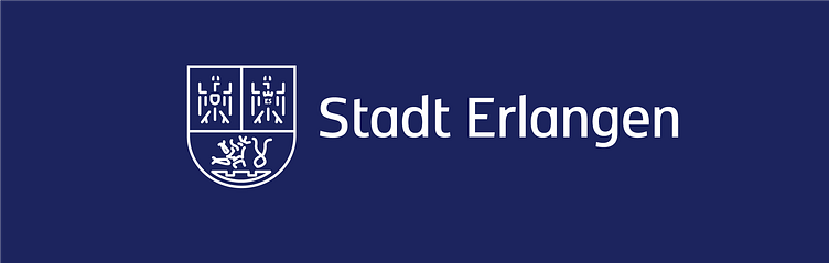
Breathing new life into tradition, my journey led me to reimagine Erlangen's logo. Honoring the city's rich heritage, I retained the essence of the old coat of arms while infusing it with a modern twist. The result? A powerful brand that bridges the past and present. The choice of the København font was deliberate, lending a touch of sophistication and strength to this iconic emblem.
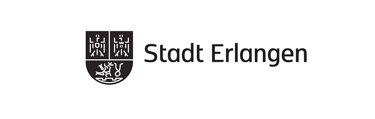
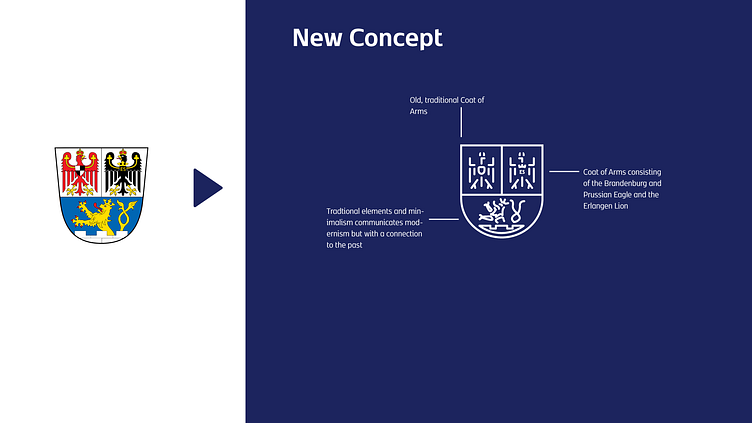
Delving into the Details: The Essence of the Redesigned Logo, where historical reverence seamlessly merges with a modern outlook, resulting in a logo that elegantly bridges tradition and the contemporary.
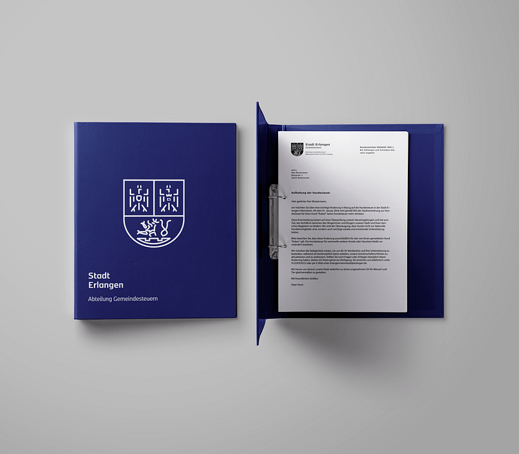
Putting Theory into Practice
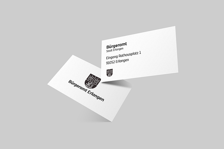
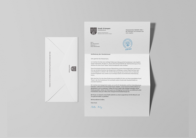
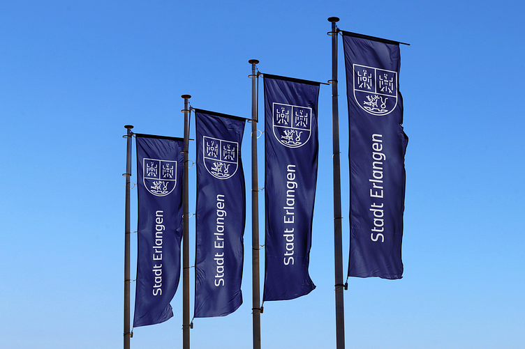
Showcasing the New Brand Identity in Action. Let's bring the redesigned logo to life across various mediums. From sleek binders that exude professionalism to flags that proudly flutter with the city's renewed spirit, and even on letters that carry messages of tradition and innovation – the new design seamless integrates into the modern, minimalist trend.
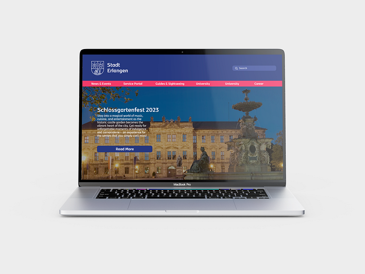
Entering the Digital Sphere
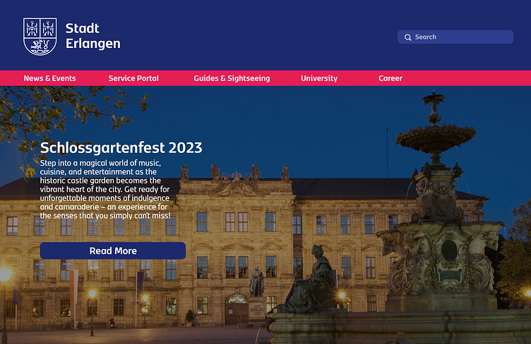
The New Online Presence. Now, we will focus on the practical implementation of the redesigned brand identity through a new homepage. Discover how the updated logo seamlessly integrates into the digital landscape, enhancing Erlangen's online representation and providing a user-friendly experience that aligns tradition with contemporary design.
Final thoughts...
As we wrap up, we observe the successful integration of history and modernity. The revamped logo, applied practically and online, showcases a city honoring its past while moving ahead. This journey underscores design's ability to connect eras, presenting a brand identity that's both timeless and forward-looking.
