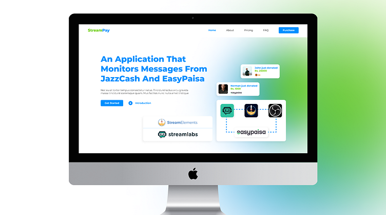
Streampay: A Case Study in Web Design
Introduction to Streampay
Streampay is an application designed to streamline the monitoring of messages from Jazzcash and Easypaisa, and seamlessly integrate them into Streamlabs and Stream Elements accounts. Developed specifically for streamers in Pakistan.
Challenges with the Streampay landing page
The landing page provided minimal information about the product, with the hero section simply stating, “Welcome to Streampay.” Additionally, the imagery used failed to convey any meaningful insights into the product’s functionalities or benefits. Furthermore, the explanation of the product was inadequate, and the purchase option redirected users to the discord server, where the software was sold.
Proposed Solution
To enhance user understanding, I employed various sections strategically. Each section aimed to communicate the product’s advantages clearly, fostering a strong desire for users to make a purchase. By incorporating detailed explanations of the benefits, I ensured that potential customers would grasp the value proposition of Streampay effectively.
Design Approach
Recognizing the shortcomings of the existing design, I set out to create an improved user experience. Drawing inspiration from Streampay’s logo, I carefully selected a colour scheme consisting of #0090FF, #6ACD00, #F5F5F5, #FFFFFF, and #383838. With these colours, I crafted design elements that would effectively convey the purpose and features of the product. The chosen font, Montserrat, complemented the design, lending a professional and modern aesthetic to the overall presentation.
Lessons Learned
Reflecting on my design process, I acknowledge that I could have made further improvements given more time. In particular, I should have dedicated a section to pricing and purchasing, addressing the initial absence of this crucial information. At the time, I opted for a Join Our Discord section as an alternative, redirecting users to the appropriate platform.
Author’s Note
It is important to mention that I undertook the design of Streampay’s website voluntarily and completed the entire project within a span of 3–4 hours.
Conclusion
Through my redesign, I successfully addressed the limitations of the original website by incorporating comprehensive and essential information about Streampay. The design focused on highlighting the software’s benefits, enabling potential customers to make informed decisions.


