Molly Mae Bakery packaging and branding
A small bakery business, Molly Mae, requested a branding package that captured the personality of the baker in an authentic and genuine aesthetic. Molly Mae was interested in building out a logo, color scheme, additional assets, and packaging.
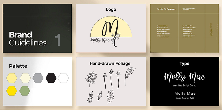
Option 1
The client specified an interest in a rustic aesthetic. With this in mind, I built out a color scheme based on light neutrals with a pops of yellow and green. I chose this color scheme to draw a connection to nature, which enhanced the rustic feel of the design. I moved to the next stage with hand-drawn foliage for accents in the logo design and branding initiative.
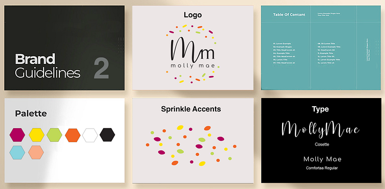
Option 2
For an alternative option, I created another design that was based on sprinkles. The vibrant colors brought a joyful and exciting mood to the bakery brand. I used simple shapes to form a sprinkle pattern for the logo.
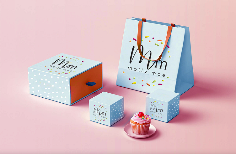
The client chose to move forward with option two. The warm and vibrant color scheme and sprinkle logo brought a cheerful and exciting mood to the bakery brand, which exceeded the clients expectations and also provided room to expanded on.
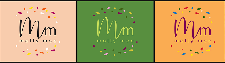
Logo variations
