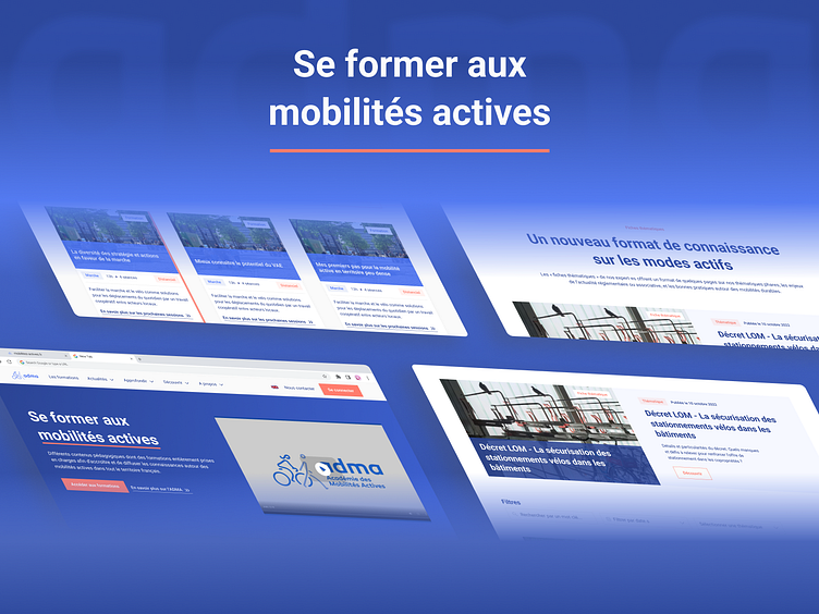
ADMA : Website redesign
ADMA is a program funded under the French Ministry of Ecological Transition's Energy Savings Certificates (CEE), and carried out jointly by the French Federation of Bicycle Users (FUB) and ROZO, an energy performance consulting firm.
Context
Rozo approached us to handle the graphic redesign of the Active Mobility Academy (ADMA) program website.
Available materials:
ADMA's existing graphic charter
Iconography & Illustrations
Mission
Restructured the architecture of the ADMA website with Rozo's team on Figjam.
(This allowed us to prioritize each page and guide Rozo to design the copywriting of the pages).
Design of the low definition (lo-fi) - UX mockups
Creation of the style guide on Figma (Typos, colors, icons, dropdown, inputs...)
Design of high definition (hi-fi) mock-ups - Desktop & Mobile UI
Delivery of the well-structured Figma file with guidelines for the development team.
Result
Mockups delivered, they are still being integrated by the development team. https://mobilites-actives.fr
Use case 👉 Use case Link
Check us more at:


