Day 003 - Dial Pad

Day 003 of @Paul Flavius Nechita 100 day UI Challenge.
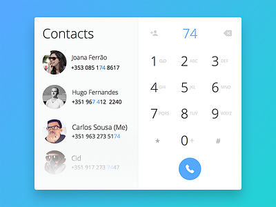
I didn't change my version that much but added a couple of extra things that might improve slightly the UI.
Added a title on contacts so it's pretty clear that section are contacts, maybe it's a bit too much but better play safe.
Changed the add to contacts icon to something clearer to the user, nothing against going minimalistic but "don't make me think". Also changed the delete typed number, again, clearer.
The number pad looks unaligned with the call button but it isn't, one of those issues with the eye alignment and item alignment.
Comments are welcome as long as they are constructive.
And that's it, see you tomorrow.
PS: All shots are going to be done in Sketch so I explore the awesome features this tool offers for UI design.