B2B SaaS Platform
The homepage welcomes clients and visitors, leaving a positive and engaging first impression. 🌟
Seems obvious, right?
However, there are times when you come across homepages that leave you confused about the company's purpose. So, what should you do when a website fails to provide this crucial information? You leave.
My Rules to Creating a Great Hero Section: A Step-by-Step Guide to Simplify and Clarify Visual Design.
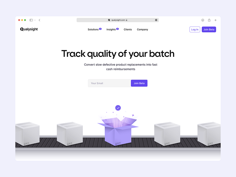
Identify the Main Purpose: Understand the core function of the product. For Qualysight, it's quality tracking for any product at any factory. Your design should echo this purpose.
Create a Bold Header: This is the first thing visitors will read. Make it bold and clear, succinctly explaining what Qualysight does.
Clarify with a Subheader: Add a bit more detail about the product's unique selling points. Don't clutter; keep it simple and informative.
Use Relevant Imagery: Select an image or illustration that visually communicates your product's purpose. I came up with boxes, that can contain anything and hi light centred one that is checked successfully.
Call to Action (CTA): Include a clear, compelling CTA that urges visitors to take the next step. It could be a 'Free Trial,' 'Learn More,' or 'Schedule a Demo' button.
Keep it Clean: Avoid overcrowding the hero section. Use whitespace strategically to make the content more readable and approachable.
Test and Refine: Finally, test your design. Use A/B testing to refine and choose the most effective design.
Remember, B2B SaaS UI enhancement is all about simplicity, clarity, and user engagement. Create a hero section that's visually appealing and gives visitors a clear understanding of what your product does.
What are your thoughts on this homepage design?
Let them out in the comments ➡️

Need an experienced designer for B2B SaaS platform?
Just say hello at: hello@alexhayes.design
