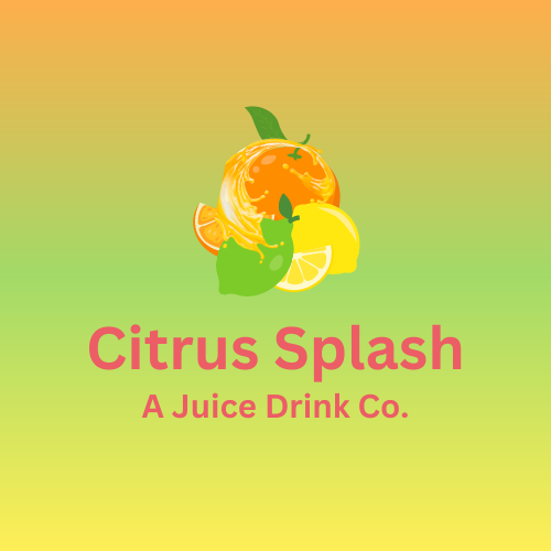
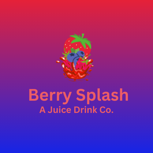
Citrus Splash A Juice Drink Co.

Logo design showcase "Citrus Splash / Berry Splash"
1. Design Inspiration:
Origin: Conceived during a hot summer day with a personal yearning for a refreshing drink.
Catalyst: The initiative to craft the logos was sparked by the impact of visual storytelling observed in a commercial.
2. Color Palette:
Citrus Splash: Features a gradient transition from #FE8D00 (warm orange), to #7CCB28 (lime green), and culminating in #FFE810 (bright yellow).
Berry Splash: A blend of #E62138 (vibrant red) that seamlessly merges into #1624E6 (deep blue), creating a purple hue intermediary.
3. Design Elements:
Citrus Splash: Incorporates a lemon, lime, and an orange. The standout feature is the orange juice splash, artistically circling the orange, capturing motion and zest.
Berry Splash: Comprises raspberries, blueberries, and a central strawberry, complemented by a juice splash from underneath, illustrating a playful dive effect.
4. Typography:
Font: Canva Sans - chosen for its modern and legible characteristics.
Size: 40, offering a balanced prominence against the vibrant backdrop.
Color: #EC5D66, a pinkish-red that contrasts well with both the citrus and berry backgrounds, providing brand consistency.
5. Brand Potential:
Versatility: While primarily designed for a juice brand, the logos' elements are versatile enough for adaptation across various flavorful industries.
Expansion: The foundational designs allow for the introduction of a broad spectrum of potential flavors and brand extensions in future iterations.
6. Target Emotion:
Engagement: The vivacious colors aim to elicit a sense of positivity, engagement, and an irresistible pull towards the drink.
Sensation: The logos, particularly the splash motifs, resonate with the exhilarating sensation of quenching thirst on a sunlit day.
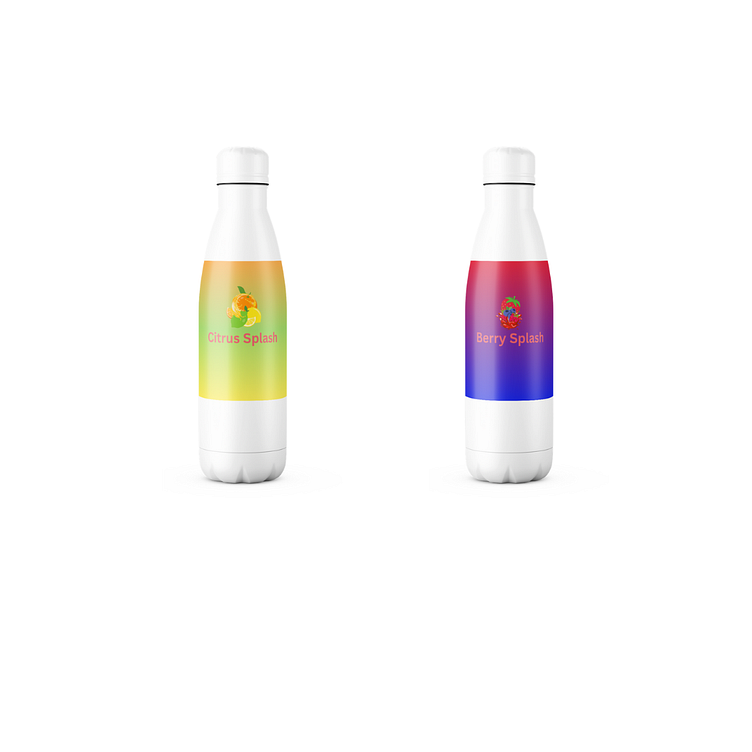
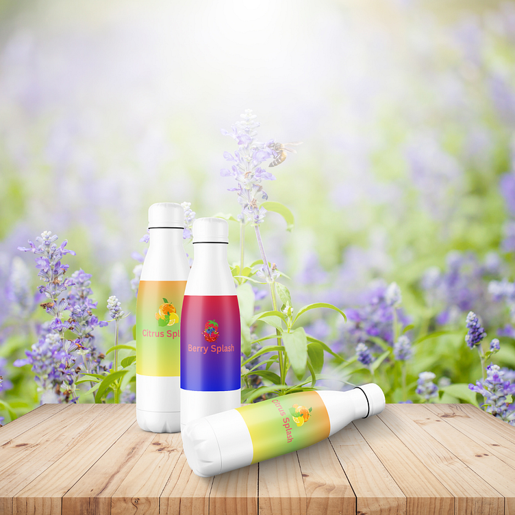
Showcasing bottle mockups
1. Studio Presentation:
In this minimalist setting, two meticulously designed bottles stand out against a pristine white backdrop. One embodies the zestful spirit of "Citrus Splash", while the other captures the luscious essence of "Berry Splash". The absence of any distractions ensures all attention is drawn to the bottle's design – from the vibrant gradient colors, symbolic of each flavor, to the artful logos that promise a burst of refreshment. This image offers a pure, unadulterated view of the product, making it perfect for a catalog or online store presentation.
2. Garden Ambiance:
Here, the bottles are seamlessly integrated into an idyllic garden scene, bathed in warm sunlight. This setting evokes a sense of freshness, with the bottles positioned on a rustic table. The scene beckons viewers to imagine the invigorating experience of sipping these flavors amidst nature, reinforcing the brand's promise of pure, refreshing goodness. It's an ideal portrayal for lifestyle marketing, resonating with those who seek authentic and natural experiences.