"ZAPS" Shiping and Logistic Branding
"ZAPS" Brand Experience Design | Brand identity
.
.
Available for your long-term or short-term partnership
Zaps Shipping & Logistics is a company specializing in efficient and reliable transportation and logistics solutions. As part of their growth strategy, they decided to undergo a rebranding process to enhance their brand identity, streamline their visual communication, and convey their commitment to speed and precision.
Challenge: Zaps Shipping & Logistics needed a comprehensive rebranding that included a new name, logo, color palette, and presentation style. The challenge was to create a cohesive and impactful brand identity that communicated their core values of efficiency, reliability, and innovation while maintaining a connection to their industry.
Solution:
Brand Name: After a thorough exploration of options, the name "Zaps" was chosen as the new brand name. The name evokes a sense of rapid movement and energy, aligning perfectly with the company's core focus on efficient transportation and logistics.
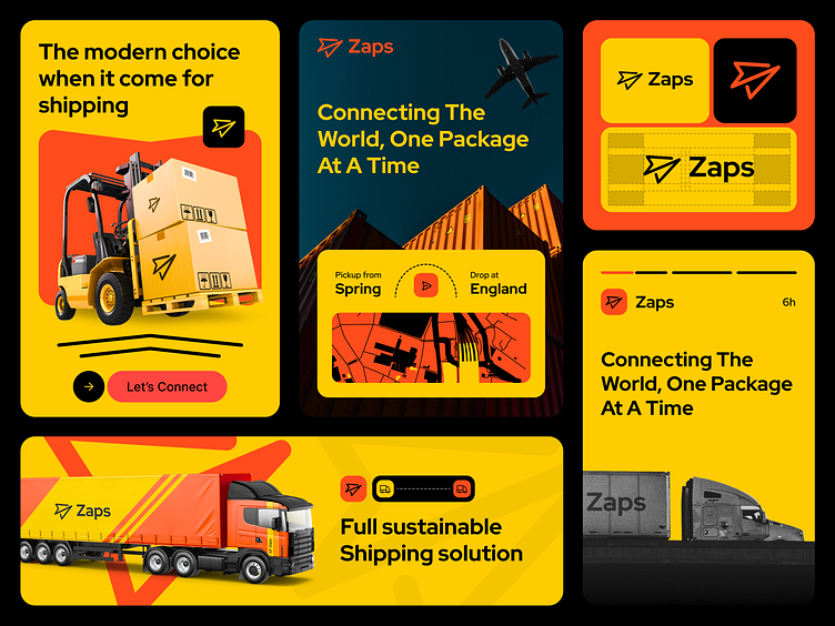
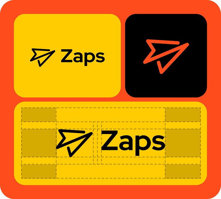
Logo Design: The logo for Zaps Shipping & Logistics was meticulously crafted to reflect the essence of the brand. The logo features an abstract representation of a paper plane in motion, symbolizing swift and precise deliveries. The choice of orange, yellow, and black colors adds a dynamic and eye-catching element, while also signifying the urgency and reliability associated with the transportation and logistics industry.
Color Palette: The chosen color palette of orange, yellow, and black was carefully selected to create a strong visual impact. Orange and yellow symbolize energy, speed, and optimism, while black adds a touch of sophistication and professionalism. This combination not only captures the essence of the shipping and logistics industry but also sets Zaps apart from its competitors.
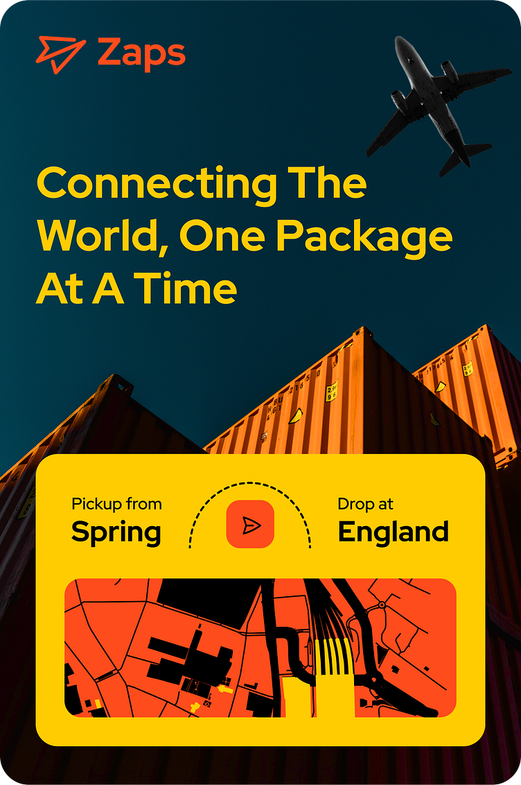
Presentation Style: To ensure a consistent and impactful brand presentation, Zaps adopted a modern and minimalist presentation style. Clean lines, bold typography, and a strategic use of the brand colors create a visual language that resonates with clients, partners, and employees alike. The presentation materials focus on clear communication, showcasing the company's services, expertise, and technological innovation.
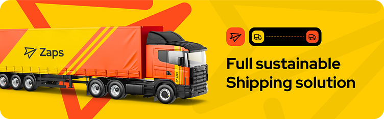
Truck Long Vehicle Logo Mockup: To emphasize Zaps' core business, a truck long vehicle logo mockup was created. This mockup showcases the new logo prominently on the side of a shipping truck. The design not only adds a real-world context to the brand but also reinforces the company's commitment to delivering excellence in transportation services.
The Zaps Shipping & Logistics rebranding successfully captured the company's values of efficiency, reliability, and innovation. The new brand name, logo, color palette, and presentation style work harmoniously to create a compelling visual identity that resonates with clients and partners. The incorporation of the truck long vehicle logo mockup adds a touch of realism and emphasizes Zaps' role in the transportation and logistics industry. The rebranding sets the stage for Zaps to continue its growth journey and make a lasting impact in the market.
Find Case Study on Behance
Available for your long-term or short-term partnership
Love to help you with UX/UI & Brand-Identity Design and help you kickstart your business.
