To the MOON - An NFT Marketplace Brighter than the Stars
🎨 Overview
As part of a Dribbble UI Design course, I've taken on the exciting task of designing an iOS app from the early concept stage to a fully functional prototype. My journey involves working closely with the client, understanding their design preferences and project brief, and turning their ideas into a real, user-friendly innovative app.
💡 Scope
Moon is an up-and-coming tech startup that wants to ambitiously revolutionize the NFT marketplace business. The goal is to create an iOS app with a design-first approach and a deeply curated experience for users.
✅ Task
Design and implement a unique visual style for an upcoming NFT marketplace iOS app.
🕒 Deliverables
Create multiple moodboards and design directions.
Establish a new visual language and identity.
Design High Fidelity UI screens.
Create a UI library housing type styles, colours, components and modules.
Create an interactive Figma prototype.
Deliver the project to the client.
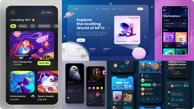
Moodboards
Option 1
In my initial design exploration, I chose to experiment with a "dark theme" concept that offers a gentler visual experience while incorporating slightly more intricate elements. This approach draws inspiration from midnight-style colors, focusing on pastel tones and shades. The objective was to work on a design that exhibits a greater sense of organization, where each element has its designated space.
Option 2
In my second design exploration, I attempted a "light theme" approach characterized by elements that exude subtlety and minimalism. This design prioritizes white space, and the focus of an orange accent color adds some artistic vibrancy. From a psychological and behavioural point of view, orange emits a sense of calmness by combining the intense qualities of red with the cheerful attributes of yellow.
Visual Exploration
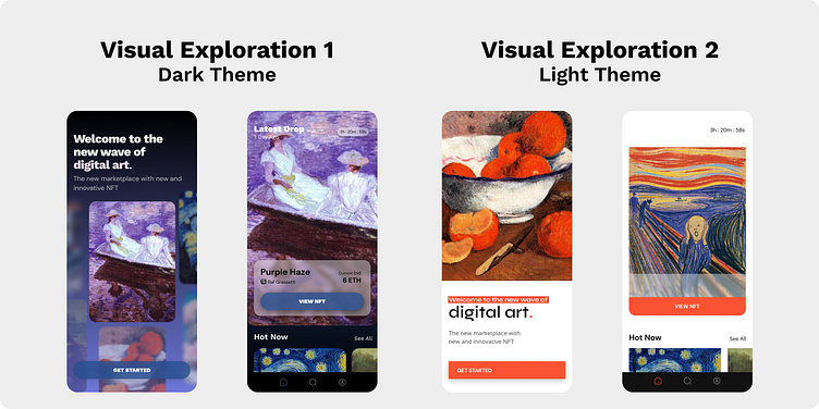
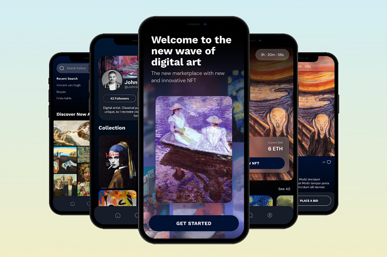
🏆 I decided to proceed with my initial visual exploration, which was centered around the "dark theme" design. This particular design aligned more effectively with the characteristics of a marketplace and exuded a more subtle ambiance.
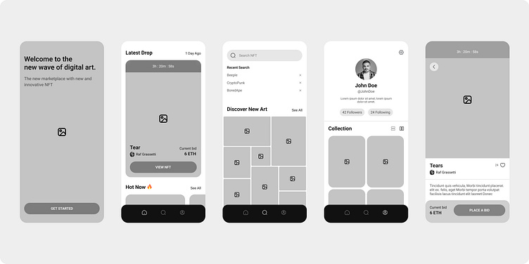
Wireframes
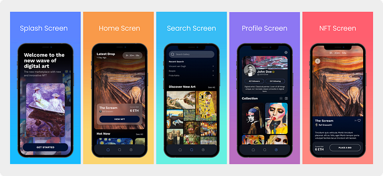
The client insisted on using their wireframes. These included 5 important and distinct screens; Splash, Home, Search, Profile and NFT.
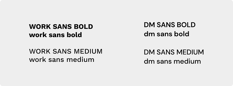
Typography
The fonts used in the design were intentionally selected for their simplicity. Since the main focus of the design is the art and the artist, the straightforward nature of the font aims to guide user attention rather than capture it.
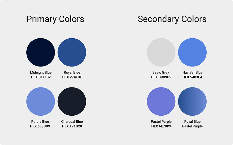
Color Pallet
The primary design colors are intended to evoke a nighttime atmosphere, consisting of blues, greys, and purples that collectively form a subdued yet gentle palette.
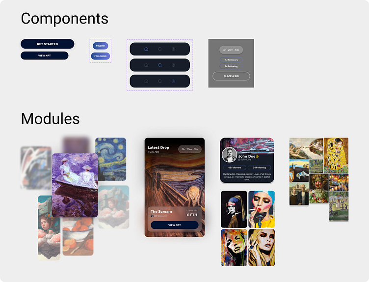
Components & Modules
The app utilizes Components and Modules consistently to uphold design and approach uniformity. Each individual component and module serves a distinct purpose within the broader design and enhances the user experience.
Final Design
Prototype
If you'd like to test out my app, you can do so via the interactive prototype.
Takeaways
As someone relatively new to Figma, this project has expanded my grasp of UI design basics and allowed me to evaluate elements from a user's point of view. It has shown me the importance behind designing elements in particular ways and how to implement those strategies systematically. Above all, I've learned
➡️ The importance of staying organized and naming layers.
➡️ Creating multiple moodboards & designs before committing.
➡️ Focusing on one element at a time before moving on to the next.
➡️ Implementing auto layout and components/modules early on.
➡️ Sticking to a consistent typography and color scheme.
➡️ Learning Figma shortcuts for my most commonly used features.
➡️ To not be afraid to challenge myself and work outside the box.
During this design process, I frequently revisited and improved my design, incorporating the valuable and constructive feedback I received. This feedback not only contributed to enhancing the aesthetics and functionality of my design but also motivated me to elevate my expectations and reach my potential
In terms of Next Steps, It’s time to tackle another project and continue to learn the ways of a UI designer.
