Thrive by Teracube
Adapting Thrive to design standards at Teracube
Teracube is in the business of making phones. Their phones sell because they are repairable and eco friendly. They are also really cheap, but are tough and last long.
They plan to launch their own suite of apps, among which Thrive is the first. It helps you manage your child's phone and apps. (exactly like Parental Control)

In my first call with the team they said,
"The app is wildly incosistent, and we don't have the bandwidth to change the flows because of how the API is structured. We would like to stick to default Flutter widgets as much as possible."
This means that we are stuck with what Material Design has to offer since, Flutter widgets follow those guidelines on Android, and we will have to do with whatever the flow is currently.
This however, was a blessing in disguise - because if done properly Material Design is more than enough. As designers, we must learn to do our best work no matter the constraints place upon us.
What needed to be change?
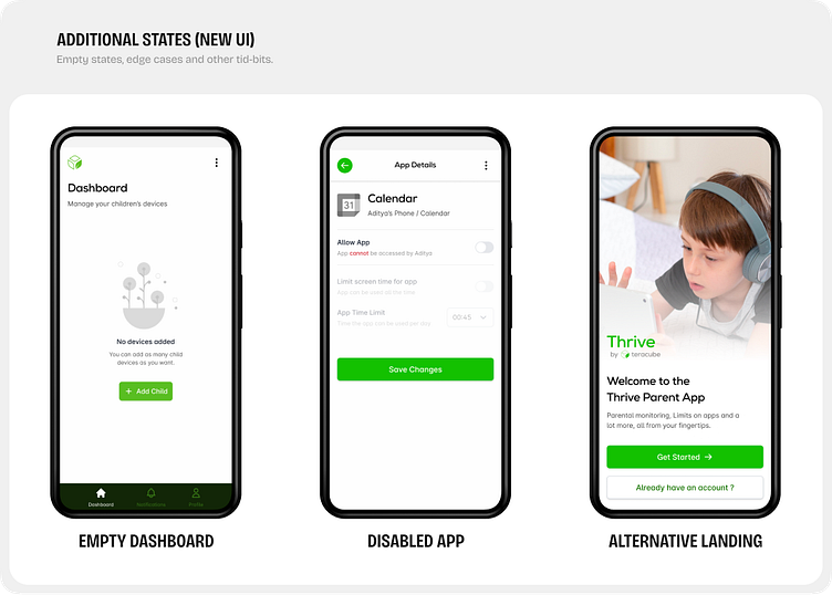
There were several issues with the existing app, you will see why in the following images.
Broadly, there were issues with,
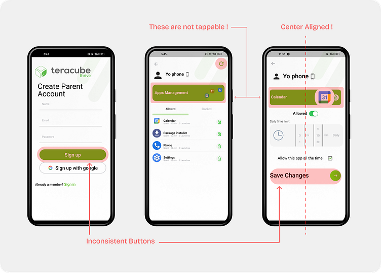
1. Inconsistent Typography
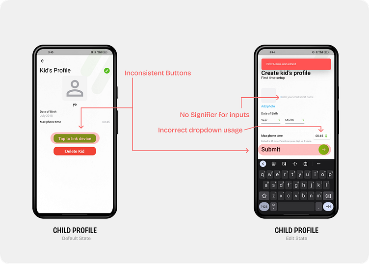
2. Inconsistent Buttons
3. No signifiers for multiple text input states
4. Non tap-able surfaces look very similar to tap-able surfaces
5. Randomly center aligned screens
6. Non MD3 pickers being used
Designing a Solution
This was a little difficult given the constraint of using just default widgets from the Flutter library, I was able to clean up the design quite a bit.
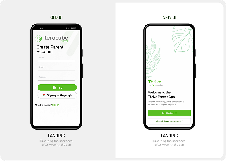
After a nice splash animation, people land on this screen. Sometimes, they might open it much later and forget what this app is needed for. They also can't uninstall this app - so it's imperative that we explain what this app is for.
Also, handling the onboarding of a new user is much easier this way. Obviously, for later - but a nice touch nonetheless.
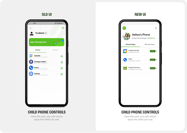
The "Apps Mangement" header created quite some confusion among users, so I fixed the heirarchy of the screen, and fixed the surface colours.
Had to retain the tab structure, however I have changed this in the next version, to accomodate more functionality on this page.
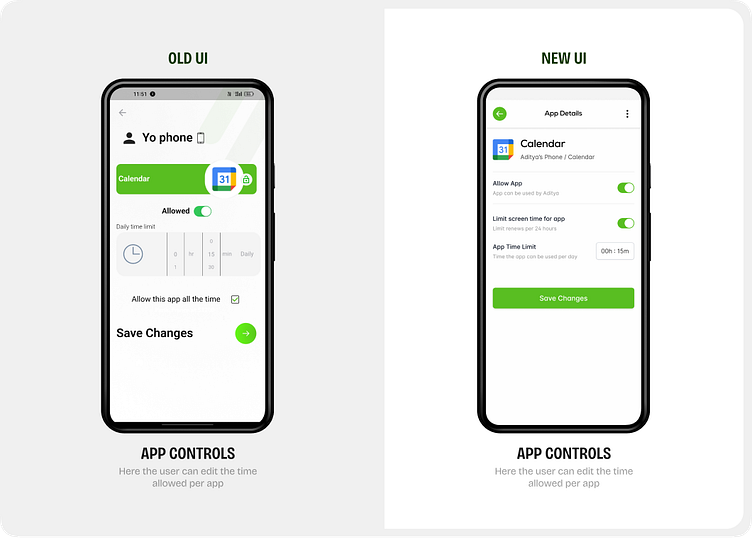
Similar problems with the page title here as well, MD3 has clear guidelines on this so I followed them and moved it to the center of the "App Bar".
Now, since both of these controls were toggles, it was easier to show them this way and reduce the cognitive load for the user.
Moved the picker to a dialog box, as indicated by MD3 guidelines, and added a signifier for the selected value.
There is a lot more to this app. Contact me for more details.
Feedback from users

Cleaning up the Child Controls screen and App Controls were a big part of the success that Thrive sees right now with it's early users. This gave them the opportunity to build on the goodwill and add more features.
Thrive Beta, coming soon! Stay tuned.
