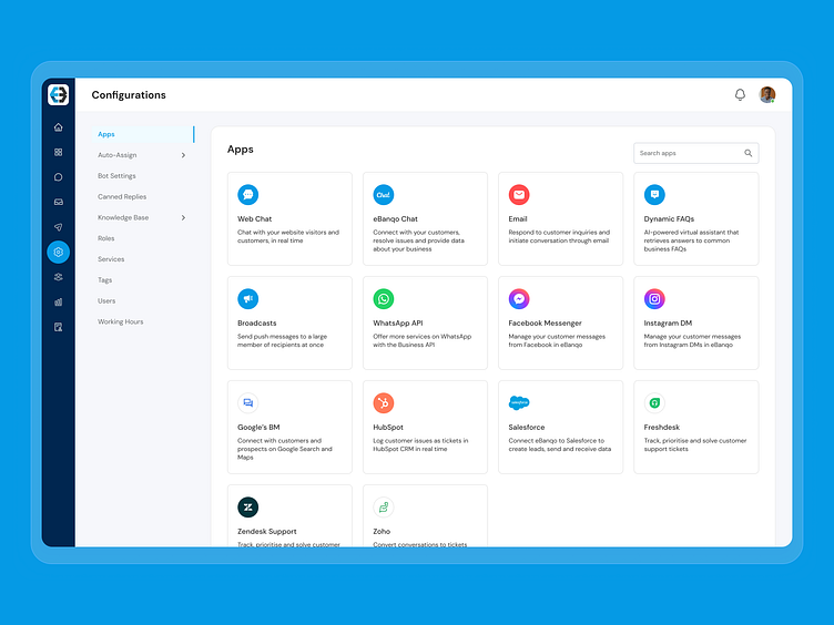
Chat App - Settings UI
Hello everyone! 👋
I'm thrilled to present a glimpse into the revamped Settings page for a conversational AI platform that I had the privilege to work on 🥳.
Addressing the Challenge
The earlier rendition of the settings page posed some significant challenges:
Inconsistent User Interface: The existing UI didn't harmonize with the seamless experience offered by the rest of the application.
Sluggish Page Load Time: Users were facing frustrating delays due to the slow loading of the page.
A Thoughtful Solution
To surmount these hurdles, we embarked on a journey of exploration and refinement, meticulously crafting three distinct UI iterations that underwent rigorous testing with our existing users. Our design philosophy centered around three pillars: Clarity, Consistency, and Modern look.
Revamping Navigation
The first stride we took was to reimagine the navigation system:
Iconic Main Navigation: We elegantly condensed the main navigation options into intuitive icons, optimizing screen real estate and lending a refreshing aesthetic.
Streamlined Secondary Navigation: Introducing a sleek vertical collapsed inline menu for secondary navigation, we achieved an interface that not only conserved space but also facilitated swift comprehension and user-friendliness.
Our Progress and Beyond
This journey marks a pivotal step towards creating a seamless and delightful user experience within our conversational AI platform. Stay tuned for more updates and let's continue shaping the future of interaction design together! 🚀🌟
Thank you for scrolling 🎉
Press "L' to show some love ❤️, and share your feedback.
------------------------
👇Get in touch with me
------------------------
Have a project idea or want to discuss something simiar?
Shoot your project inquiry to fagbolagunidowu@gmail.com


