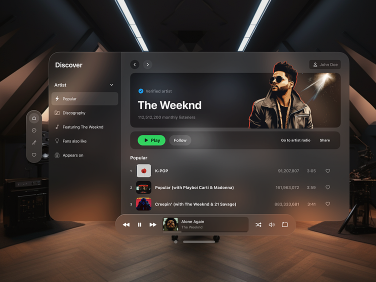
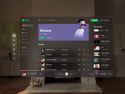
Spatial Design for Spotify
Spatial UI Design Concept for Spotify
This design follows Apple's spatial design guidelines and was crafted using resources and assets from August 23.
Beyond aesthetics, the design emphasizes depth, scale, windows, and immersion to foster a user-centered and comfortable experience within Spotify.
The UI has been streamlined. The primary navigation emerges from the left upon viewing. Emphasis has been placed on artist information and playback controls.
Reach out to me for product design inquiries: laura@experiencedesign.ee
More by Laura Ader View profile
Like

