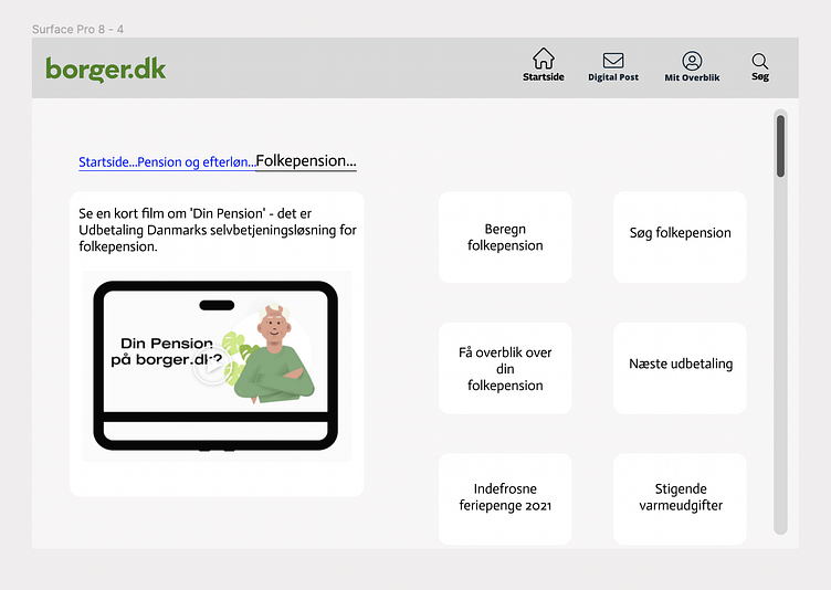
borger.dk redesign: breadcrumbs
As was mentioned quite a lot by the the elderly participants at the workshop, navigation is one of the primary pains in their use of borger.dk and similar interfaces. When exploring a website, the participants might have been able to find what they were looking for, but then felt lost and compelled to go all the way back to start. I wanted to include some breadcrumbs and ideally make them a little more aesthetically pleasing than is seen above. However, the participants didn't seem to take to a less traditional UI, hence the very retro-looking breadcrumbs.
More by Sofie Juul Nisted View profile
Like
