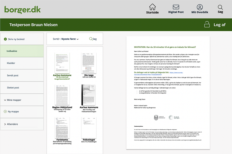
borger.dk redesign: inbox
Based on the insight that elderly users tend to leave their documents open in order to better find them, I decided to use thumbnails to give a comprehensive overview without crowding the screen and providing easier navigation. While the thumbnails are very small and this doesn't quite match the principle of higher visibility, the users were able to recognize documents faster from just the shape of the text.
More by Sofie Juul Nisted View profile
Like
