Dribbble Capstone Project

Project Brief
As the Head of Digital for the newly launched IPTS: The Interplanetary Travel Syndicate, you have been tasked with creating 3 unique offerings:
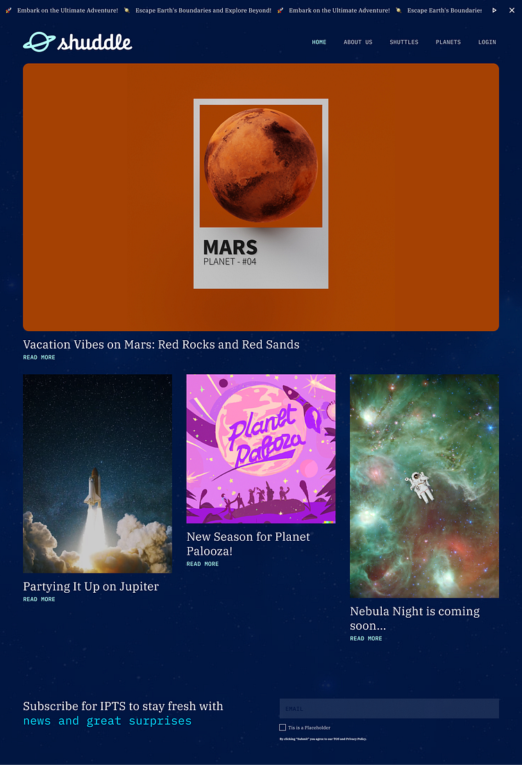
ipts.org: an informational website containing the latest IPTS news and happenings
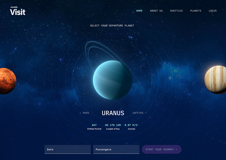
IPTS Travel: a site enabling browsing and bookings to destinations within our galaxy
IPTS Rail: a real-time web app where you can view lines, routes, and times for various commuter lines
Our Concepts
Futuristic aesthetic of early 2000
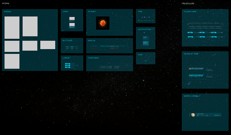
Design System
IPTS ORG
Key Features:
Prominent News Feed: Displaying the latest news with eye-catching thumbnails and concise headlines.
Clear Navigation: Simplified menu for easy exploration of different sections.
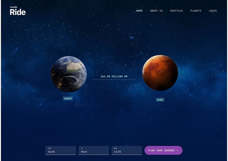
IPTS TRAVEL
Galactic Hero Image: Creating an aspirational vibe for travel enthusiasts.
User-Centric Search: Intuitive search bar allowing users to discover destinations by interest or name.
Detailed Destination Pages: Comprehensive details, photos, and interactive maps for each location.
IPTS RAILS
The design strategy centered on real-time updates and user convenience. The homepage featured a dynamic map displaying live train positions and highlighted delays. Users could easily explore different commuter lines, view routes, and check schedules through an intuitive interface.
RE-BRAND
Your leadership at the IPTS—the Interplanetary Travel Syndicate—just hired the prestigious branding firm MegaBrand to do a rebrand of the entire organization, and there are a few things that’ll affect the three products you’ve been working on.
MegaBrand discovered through focus groups that the IPTS name and logo felt very ominous, like it was cold, faceless corporation that was always watching. (“The eyeball-shaped logo doesn’t help,” said one candid participant.) In addition, the IPTS wants to appeal to a younger demographic.
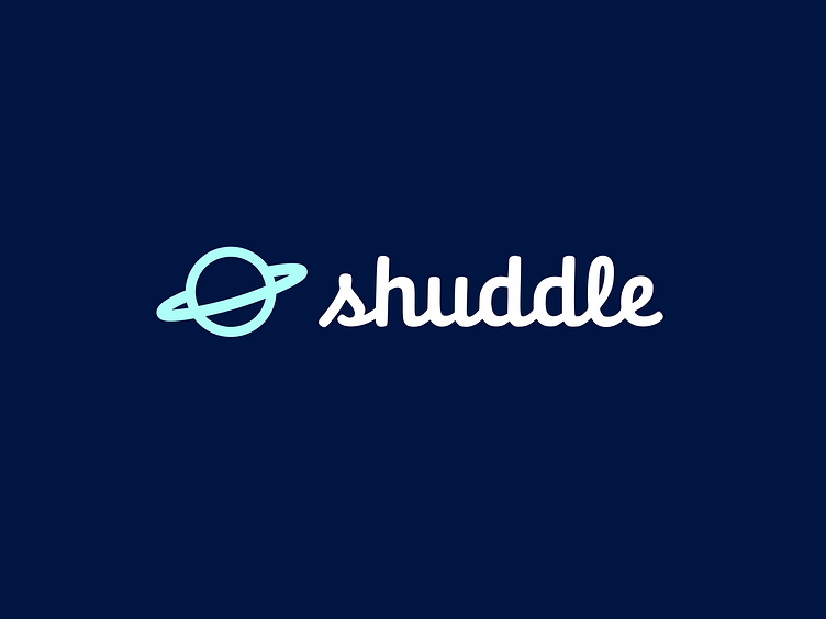
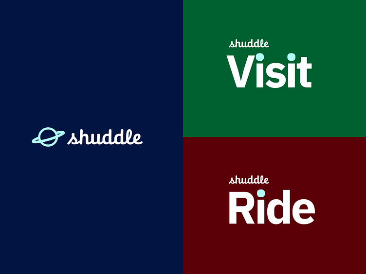
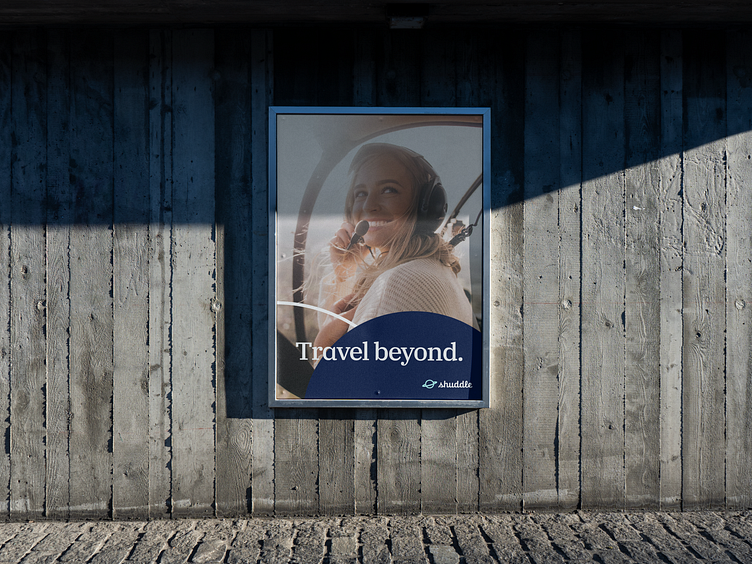
After weeks of research and exploration, they’ve settled on the new name “Shuddle,” which feels more like a cool, new startup.
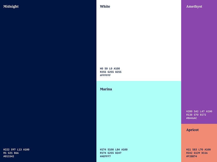
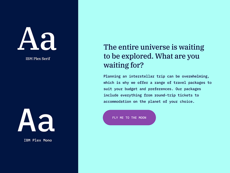
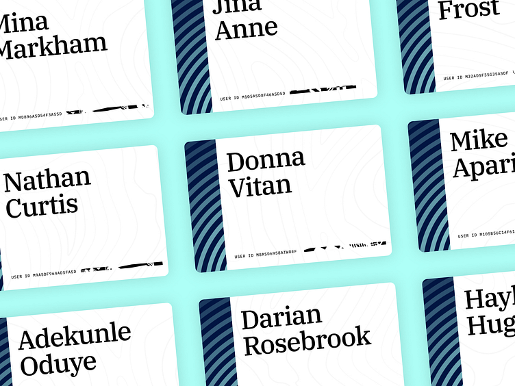
Identity


Our Concepts
Shuddle
Shuddle Visit
Shuddle Ride