John Burrell's HAC
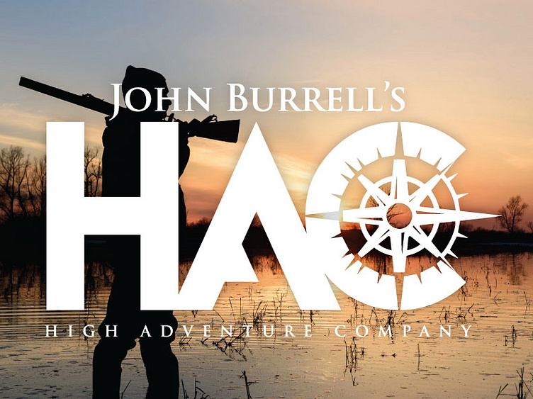
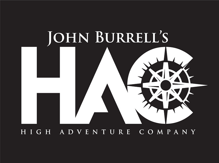
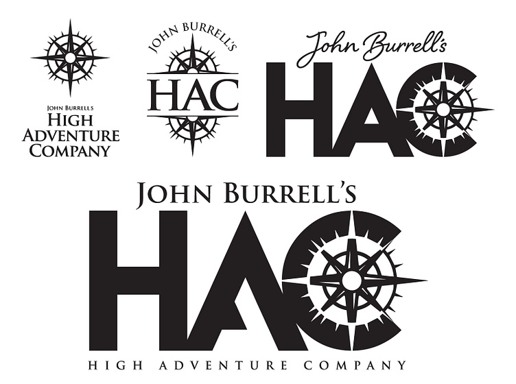
We were tasked with transitioning this multi-national sporting property management company. They wanted to create a mark that focused more on the shorthand HAC, while retaining certain elements of the current logo. While the client has chosen this final design, implementation on such a wide scale is quite an ordeal, and the details for the various applications (everything from monogrammed towels to glassware) are still in process.
