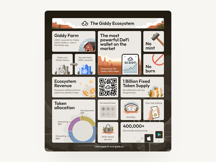
Giddy farm bento grid
If you’re a designer and haven’t created a bento grid, you’re missing out.
They allow you to mix and match content blocks in a variety of ways.
...but without sacrificing visual harmony.
Aside from being fun to make, other benefits of designing with a bento grid include:
- improve visual hierarchy
- compactly organize data
- simplify complex information
- optimize the use of screen space
- less boring than lists and/or rows
- add interest to the flow of content
Apple & Microsoft have used bento grids in their presentations & products. It's likely that they popularized the trend.
The word “bento” originates from Japanese style lunch boxes (google it, you’ll see).
I created one (pictured above) in collaboration with our community captain, Joey. It highlights many of the innovative features of the new Giddy Farm we just launched in our app.
