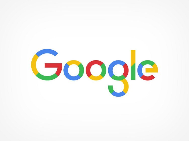
Evolving Google
I have no nostalgic feelings towards the old Google logo, it was always pretty terrible and long overdue for a redesign. The new logo however just feels too generic and anonymous. Nothing about it stands out and the one colour per letter just reminds you of the old logo.
I quite liked what they did with the multi-coloured single G though and in their presentation of the new logo there was also a variant that used multiple colours for each letter, so I wanted to play around on that idea while also putting in a few more details to make it feel more like its own unique thing.
More by Claes Källarsson View profile
Like
