Omnia Rebranding Case Study
Our new Behance case is now live! Rebranding, identity development and website design for Omnia - personal wellbeing training centre in Amsterdam.
The project initially started with updating Omnia's web presence. We ensured a smoother and user-friendly digital experience, maintaining consistency across platforms and solidifying the brand's digital presence.
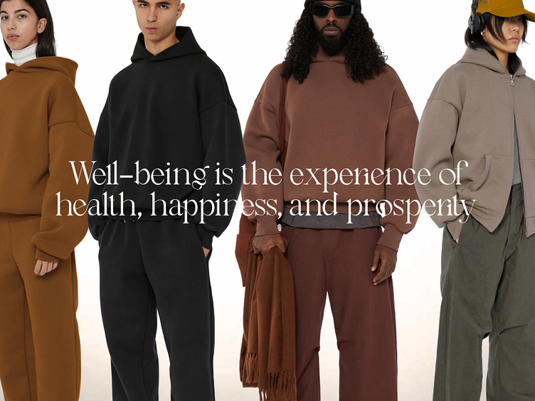
After the successful web implementation, the client asked us to develop their branding further. The challenge was to breathe new life into their visual language without altering the core elements, namely the logo and fonts. We started with systematising existing brand materials to understand Omnia's persona and visual identity. The updated "Defining wellbeing" concept arose from these findings, incorporating wellness-related terms as main graphics and used in their new merch line, aligning with Omnia's mission of promoting health and mental wellbeing.
Exterior designs of all training centres were also rejuvenated, with striking fonts and private yet open aesthetic elements (by using blurred tape), harmonising with the distinctiveness of each location and attracting attention to Omnia centres.
We also created the "Rain & Fog" collection extending the brand narrative, resonating with Amsterdam's weather conditions.
With a balanced infusion of fresh ideas and foundational elements, we strengthened Omnia's connection with their clients. Today, Omnia is poised to inspire wellbeing with its creative merchandise, user-centred digital platform, captivating signage, and vibrant brand narrative.


