Pinter Academy - Dashboard
Hello Dribbblers! Here is the Pinter Academy Dashboard
Overview
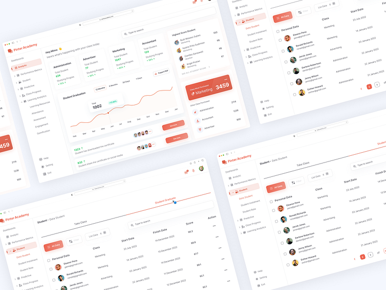
Indeed, this is the dashboard view of Pinter Academy. Pinter Academy is an educational platform that offers various types of classes for beginners and professionals aiming to advance their careers. The available classes include becoming a proficient administrator, advertiser, accountant, and effective marketer. You can explore the dashboard view of Pinter Academy below.
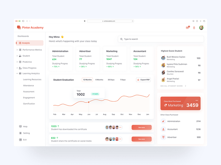
On the first page (Analytics), you will find various pieces of information that facilitate tracking and monitoring of Pinter Academy's activities, including:
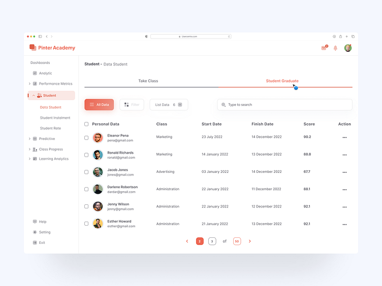
Updates on the number of students and their progress in each available class. Through cards containing total student count and progress, you can identify active classes and observe the average percentage of completion for students in that class's learning journey.
Student Graduation Graph You can view the count of graduated students with various selectable time ranges. Additionally, you can directly download desired data from there.
Download and Share Certificates You can monitor the number of students who have downloaded certificates and those who have shared their certificates directly on their social media platforms.
Highest Scores Daily updates of the highest scores achieved by students who have completed their classes can be observed. Beyond identifying top performers, this feature aids in assessing the difficulty and ease of course materials, enabling periodic updates.
Most Enrolled Classes by Students Continuously monitor the total number of students enrolling in your classes while they are open. This serves to facilitate corrections and strategy adjustments to attract more interest to classes that may not have initially garnered significant attention.
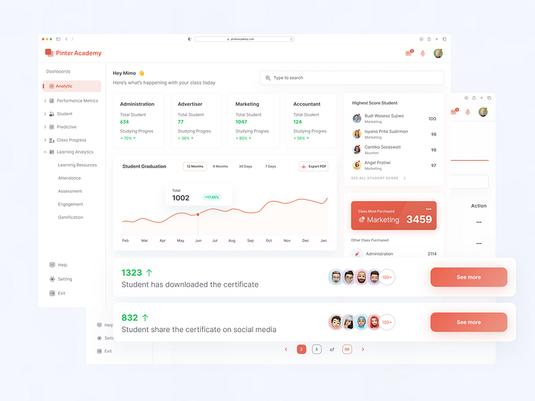
In this post, I'm implementing one of the UX Laws known as Fitt's Law. This law states that the time required to reach a target is influenced by the distance to the target and the size of the target itself. Are there too many buttons that users need to press? Are they within easy reach? Perhaps, the buttons might even be too small, potentially disrupting the user experience. This implementation is evident in the "see more" button, designed with the goal of enabling users to quickly and easily view those who have downloaded and shared their certificates on social media platforms.
Hope you like it. I would greatly appreciate your feedback.
We are open to new projects!: usercentra@outlook.com // afrimimo10@gmail.com
Press "L" for like. Thank you
