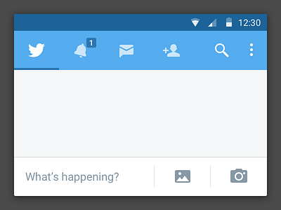
Twitter - Tabbed Navigation (experiment #1)
I'm not even a fan of redesigns and certainly I didn't want to re-do the whole thing. There are several reasons for this.
Anyway, in these days I'm looking at navigation patterns for Android.
It's SO intriguing!
Now every time I look at an App, I try to figure out how it would function in terms of Navigation.
I spend quite some time on Twitter and I figured out, it could be using a tabbed navigation system, so that it would be easier to jump between sections.
I'd like to remove the "Add Contacts" tab in exchange of—say—"News". I personally wonder why the Twitter design people decided to give this tab so much relevance. I would either bury it somewhere or try to contextualize it as much as possible. Just my 2 cents.
Icons are done by me (besides "more" anf Twitter's logo). I tried to match Twitter's Style with Material Design.
