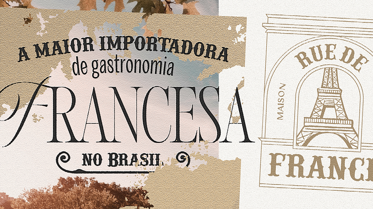
Rue de France
Rue de France is an importer that already carries its mission in its name: to bring to Brazil the gastronomy experience present in the French streets. The main challenge of this visual identity project was cultural, it was to convey the traditional and intimate atmosphere of French boulangeries that Brazilians love so much and immediately associate with care and high quality.
The visual strategy prioritized the immediate recognition of the Brazilian imagination when we talk about France and gastronomy. To convey all these feelings and impressions that I described above, the study of typography, architectural traditions and French artistic movements was very important. For a Frenchman this project will come up against what we know as a cliché, but it is important to remember that the business is in Brazil, therefore, very different cultural perceptions.
About creation, the two biggest references for the construction of the logo were the Eiffel Tower and the Arch of Triumph. Placing these shapes sharing the same space gave birth to a unique symbol full of traditional feelings, but with modern and very flexible applications. The result of this united intention, perception and consumption.
Art Direction: Carlos Mello
Account Manager: Jullyana Caetano
Project: Visual Identity
Client: Rue de France
Location: Campinas, São Paulo
Studio: CEXM
Year: 2023


