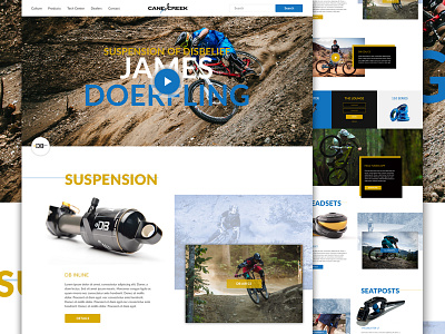
Cane Creek Cycling Components - Full
Here's full pixels for my concept redesign of Cane Creek Cycling Components' website.
After feeling a bit too boxed in with my original direction, I decided to explore an experience similar to @Ben Johnson's Jack Dusty projects' "exploded grid", but without actually breaking the grid, so this is a bit of a hybrid: Using elements that are contained to the grid, and others that are relative to the edges.
Hope you Like it! Any feedback is appreciated as well!
Thanks to @Christopher LaRose, @Chris Burda, and @Jake Hill for their insights along the way! They do beautiful work. Go follow them.
More by Ryan LaBar View profile
Like


