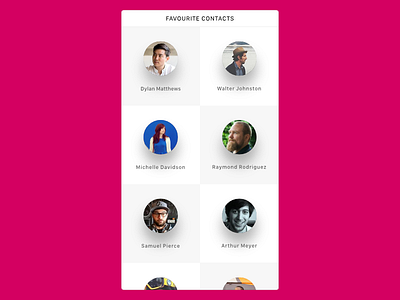
Contact List Screen
I've been experimenting with a different style of displaying a contact list, putting pictures front and center and using very low information density to make it easier for the eye.
I've also used very wide shadows behind those profile pictures to make them look as if they're hovering above the background which adds a little bit of dimension.
More by Eike Drescher View profile
Like

