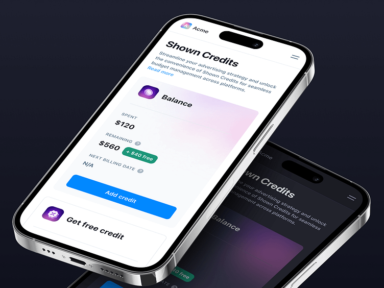
Shown AI · Dark and Light Modes · Credits 🌓
Hey all! 👋 Sharing here a quick glimpse of Shown's mobile Dark and Light modes. Alongside the redesign of their app, with Shown's team we worked to refresh their dark mode, and complete their color palette, while creating new features, components and updating current pages. Our aim was also to synchronise both light modes and dark modes palettes, to create a coherent user experience. For this, we also mapped all color usages.
Shown's AI and software allows users to automate the ad campaign creation, through smart AI suggestions and content creation. Shown is a one app to manage all ad campaigns from different platforms and collaborate as teams.
Services provided:
— Product Design
— UX/UI Design
— UX Research & Visual benchmark
— Illustration
— Design System


