Bewakoof!

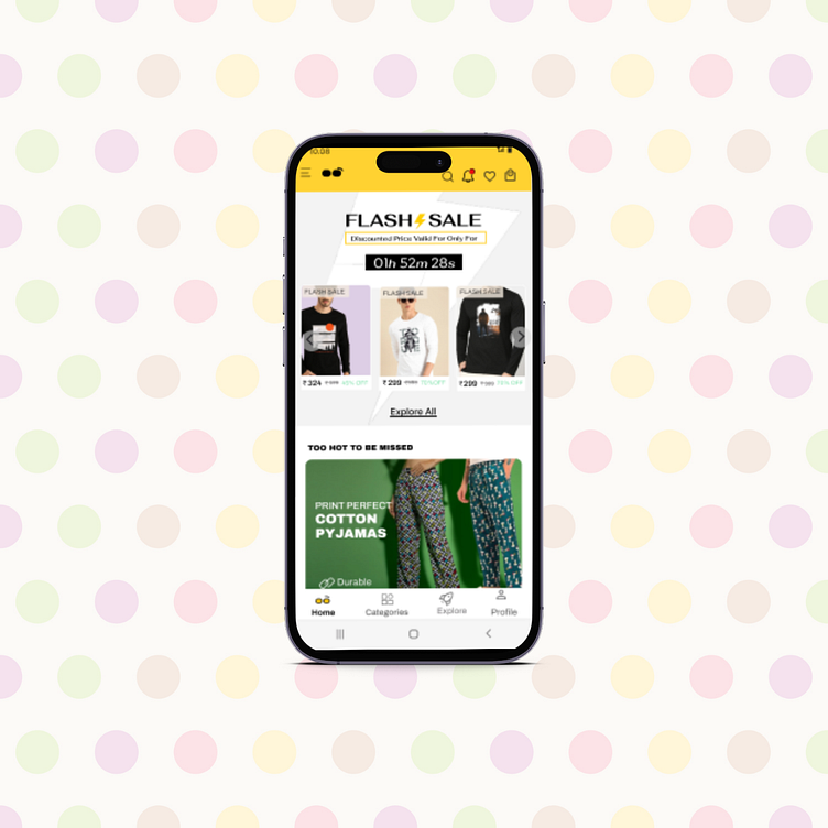
Bewakoof App's Home page
Bewakoof!!📢
Before you jump to conclusions, let me clarify – I'm not calling anyone 'Bewakoof' (foolish)! I'm just bursting with excitement to share the awesome tweaks I've made to the Bewakoof App's home screen. It's incredible how even the tiniest details make a big difference!
Now, why Bewakoof? Simple – I've been a loyal fan for years! Their pocket-friendly and top-notch clothing perfectly suits my comfort-driven style.
As a design enthusiast, I recently dove into their app with a newfound attention to detail (pun intended) 🚨, and guess what? I spotted a few heuristic issues. So, I decided to roll up my sleeves and iterate on these hiccups – and of course, explain why these changes are vital. 🚀
Time to level up the user experience!
First up, The Banner Section – where we have the Flash Sale, Discounted price, and hours remaining too close for comfort.
Problem: Objects packed too tight! You know the Law of Proximity, right? Well, when elements get cramped, they lose their charm. So, let's give them some space and make it aesthetically pleasing !
Solution: Equal Spacing, yes!
The Slider Section: Right below the Flash Sale, we've got three awesome T-shirts, but their frames are playing the size game.
Problem: Symmetry! Asymmetry and disorganization don't jive well with our peepers. We need some balance in our lives!
Solution: Bring on the alignment magic!
There you have it- Let's keep the vibes high, the aesthetics on point, and give users the best experience ever. Cheers to a rocking' app!"