Case Study: Scaling Design Systems w/ Dan Mall Capstone Project
The Scaling Design Systems with Dan Mall Capstone Project is the culmination of 8 weeks of intensive course lessons focused on creating and scaling design systems. The project serves as a showcase of the skills and concepts learned throughout the course. Students are provided with a mock creative brief, design assets, and are tasked with crafting a comprehensive design system that satisfies the project requirements.
Capstone Week 1: Kickoff
Dan Mall’s Measuring Spoon Cycle for Design Systems
Foundation Setting
The project commences with the establishment of the Figma environment. The Design System file is created, leveraging elements from previous weeks' work as boilerplate. Reference is made to Dan Mall’s Measuring Spoon Cycle for Design Systems as a guiding framework.
Me quoting Dan Mall
Requirements Gathering and Content Strategy
Requirements gathering begins by brainstorming content needs, often aided by AI tools like ChatGPT. This process informs the identification of necessary components and those that can be reused. Content outlines are crafted, highlighting potential interface components and patterns that align with the content.
Market Research and Inspiration
The project's brief draws inspiration from sites like Expedia, NYC Subway, and London Underground. Screenshots of these sites are annotated to analyze component usage. Additionally, research is conducted on travel-related and space-themed websites, expanding the pool of component examples.
Wireframing and Initial Design Exploration
Wireframing is initiated to validate assumptions and generate a basic structure for the design system. Rough wireframe sketches are created, focusing on atoms, molecules, and organisms for potential reuse.
Even though the brief calls for 3 pages, I created 2 with the intention of the 3rd page being a combination of the first 2
Asset Creation and Styling
Visual assets, including illustrations and photography, are generated to align with the project's theme.
Midjourney is utilized to create relevant imagery.
Color palettes are derived from said generated images and colors ramps are made with the Supa Palette plugin
Typefaces like Open Sans were selected for their versatile nature
The Typescales plugin was used to generate a range of font sizes
/imagine: illustration of people on vacation in outer space in the style of retro futurism, photograph of people on vacation boarding a spaceship
Page Design and Component Creation
High-fidelity page designs are developed, integrating the wireframe components with consistent styles and colors. A centralized Figma page is employed to organize wireframes, reference materials, and components, streamlining the design process.
While creating, I like to have all of my reference and components on the same Figma page
Design Challenges and Refinements (aka, WTF Figma?!)
Challenges involving component interactions, such as icon variants and button states, were present during Prototype creation. This appeared to be a Figma bug with the root cause being (possibly) naming conventions. I decided to make note of the prototype inconsistencies within the reference site and move forward.
Lastly, a focused effort is made to organize and clean up components while refining the final design for the IPTS Rail page.
Capstone Week 2 Rebrand
Evolving the Design System
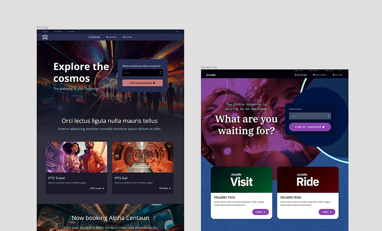
The second week of the Capstone project introduces a rebranding phase to showcase adaptability and scalability.
Incorporating the Rebrand
New assets including fonts, colors, and imagery are introduced for the rebranding phase. A careful assessment of these elements is undertaken to understand the new brand's direction.
Typography and Color Updates
Typography is updated using the new IBM Plex Sans font, with awareness of the availability of other font styles if required. The color palette is overhauled, with a new primary color (Midnight) selected to align with the new brand identity.
Product File and Asset Update
The product file is updated to reflect the changes introduced in the rebrand. Existing components are replaced with new versions, and a structured approach is followed to ensure smooth transitions and preserve design history.
Generating New Assets
New assets are generated to support the rebranded design system, utilizing prompts to create fresh imagery in alignment with the updated brand direction.
Delivery: Showcasing the Design System
The project concludes with the delivery of the design system and associated assets. In order to prepare for this phase, I spun up a Zeroheight site to act as the Shuddle Design System reference site.
With the Zeroheight site in progress, I realized I needed to organize the components into separate pages.
All the components on a single page
Components moved to separate pages, set to ready
Distribution of Figma Links and Reference Site
Links to the Figma project, complete with design system documentation, assets, and pages, are delivered. Additionally, the Zeroheight reference site is shared to provide a real-world demonstration of the design system's application.
Case Study Completion
This case study serves as a comprehensive record of the Scaling Design Systems with Dan Mall Capstone Project, showcasing the project's journey from inception to delivery. It demonstrates the application of design system principles, content strategy, market research, wireframing, asset creation, and the iterative design process in creating a scalable and adaptable design system.


