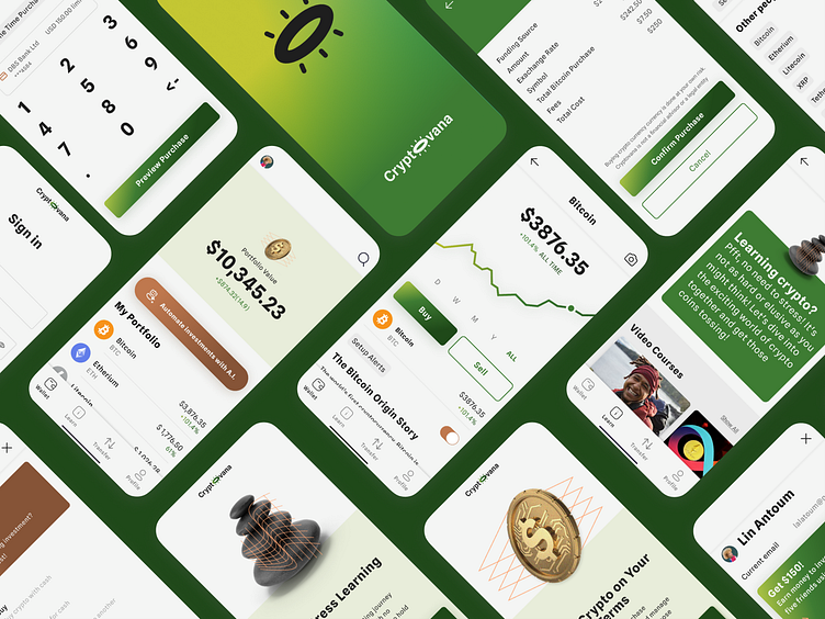
Cryptovana: UI & Branding Design
Project Overview
Design Brief
Design a crypto trading app that is simple, non-intimidating, and allows people to invest easily.
Problem Statement
Crypto currency is confusing and intimidating. We hope to design an app that is easy to understand, fun to use, and approachable for all. Our user is not a techie or crypto veteran. They are most likely new to the crypto market and the need a little bit of handholding and education to make them feel safe.
User Research
User interviews and surveys for the target demographic were conducted prior by our team members. My goal was to focus on UI design and branding.
Business Goals
Market Research
I looked at four different popular apps in the market that provided some form of cryptocurrency investment service. I focused on the UI patterns, visual design (look and feel), and the services they offered.
User Persona
User Flow
This flow is designed to take the user through onboarding and then to the process of buying some bitcoin.
Low Fidelity Wireframes
Moodboard
Branding
Visual Identity
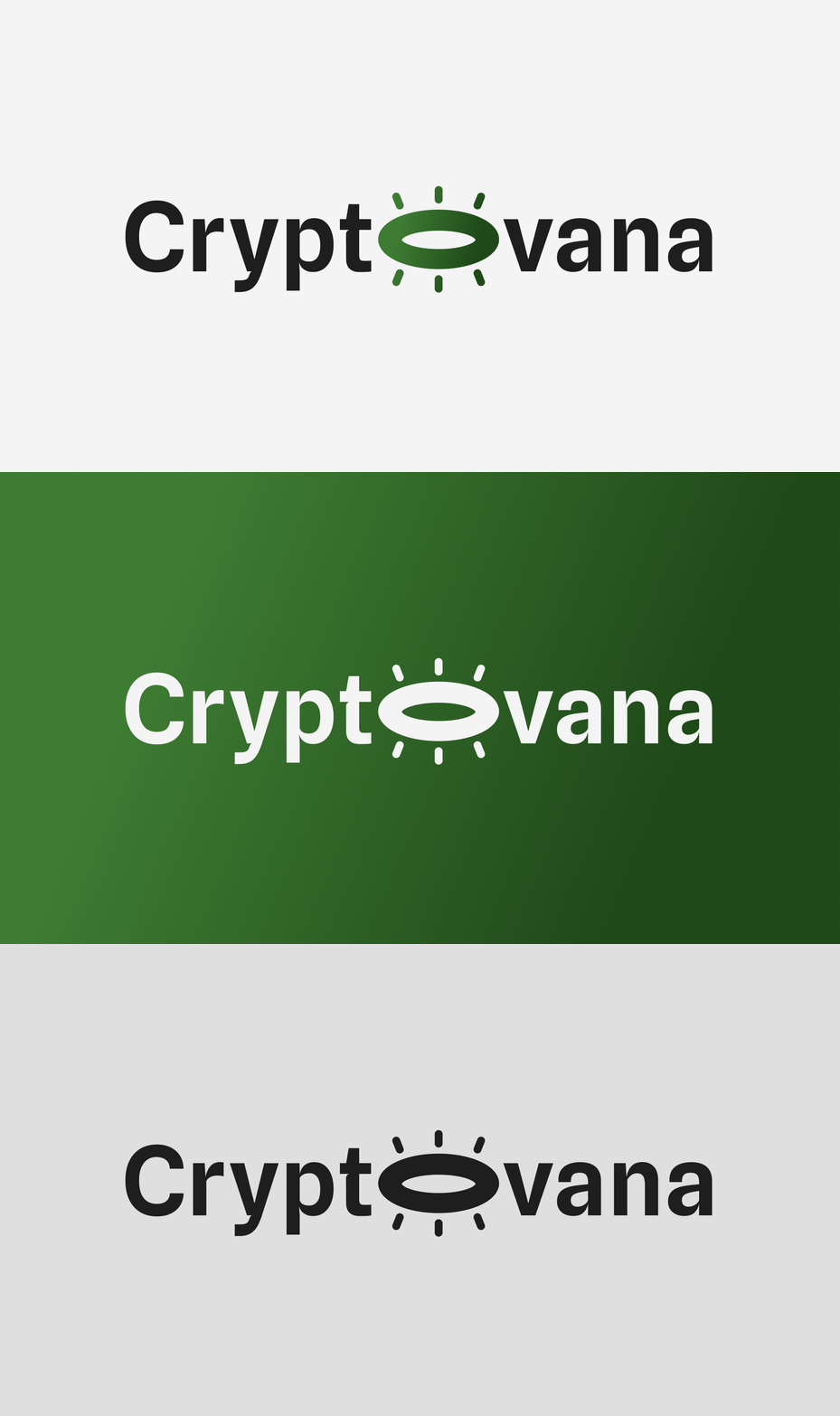
The cryptovana halo, is a visual representation of the state of ecstasy we hope to create for end users who interact the intuitive ease of our investment product.
Color Palette
The color palette was carefully chosen to reflect the need for simplicity and minimalism by beautifully combining natural green and brown tones.
Typography
I opted for the Spline font because of its UI-friendly, modern, and uncluttered appearance.
Components
A mockup of the app icon in action.
High Fidelity Wireframes
Prototype
Usability Testing Feedback
Outcomes & Results
The original goal of creating a simple and non-intimidating crypto app for the core user was successfully met.
Each of the the four main business goals were met, via the 3-step crypto buying process, the simplified clean UI and financial information, and inclusion of ample learning resources.
Based off of the usability test feedback I would make it easier for users to access cryptocurrency specific learning resources directly in each of the coin listing screens in the incorporate.
I'd change the transfer menu option to a pull-up item instead on an overlay for quicker access.
There are opportunities to add motion throughout the app and especially to the purchase success screen at the end of the transactions.
The gamification of learning resources would also be something to add in.
I use finance apps in my day-to-day life and really I enjoyed creating the visual design of the app as well as thinking through the functionality based on user insights.


