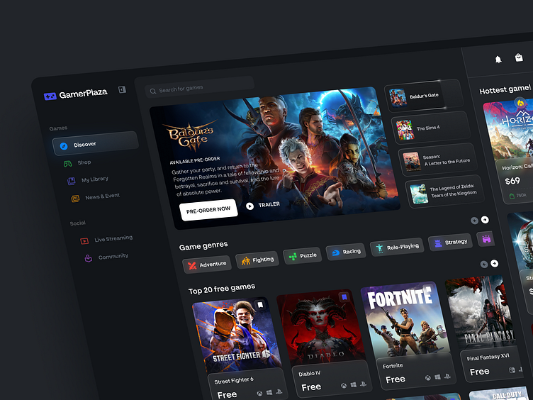
Game shop - web design
Hola Dribbblers! Here is the new web design concept for game marketplace.
Overview
GamerPlaza is an innovative platform in the gaming industry with a mission to revolutionize how people shop for games. In addition, the platform also enables live game streaming and there is a community to facilitate communication between gamers.
On the main page (Discover), you will find four key features:
Banners
When accessing main page of GamerPlaza, users will be welcoming by banner showcasing upcoming game release or promotion banner. Each banner present slick visual with short information to interest users and explore banner.
Game Genres
This section show a slider tab menu of various game categories, available to explore. Categories cover different types such as adventure, strategy, sports and more which will keep update. Each category has icon and title that respective type of game, to make easier navigation for users.
Top Free Game
Users can find recommendations game for free that can be played. This section purpose to attract users to come to the GamerPlaza website.
Hottest Game
On the right side of screen, there is card list of currently popular playing game. Including statistic information on purchases, ratings from users and fire icon.
In overall on this design exploration, I apply the principles UX law of Common Region. Law of Common Region is a principle in visual psychology that refers to our tendency to group objects that are in the same area together as a unit or group.
Hope you like it. I would greatly appreciate your feedback.
We are open to new projects
usercentra@outlook.com // hello.syafii@gmail.com
Press "L" for like. Thank you


